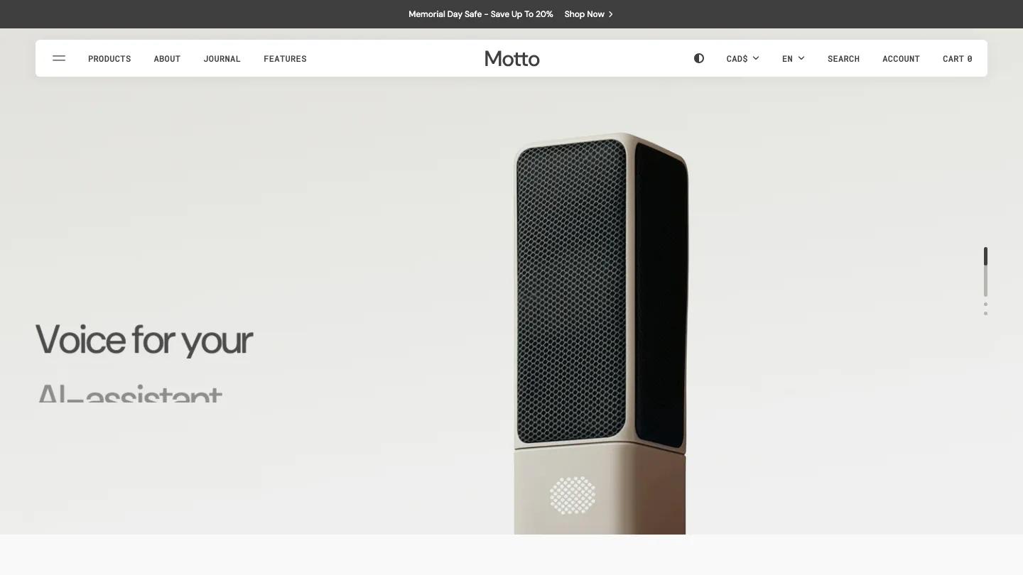
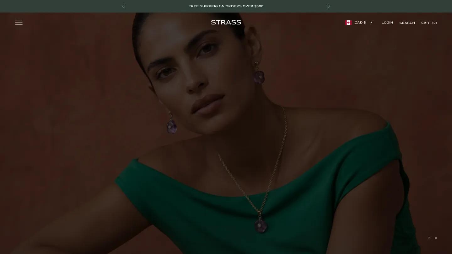
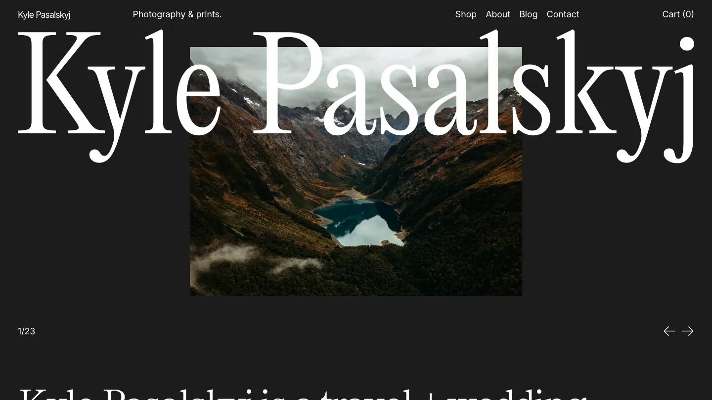
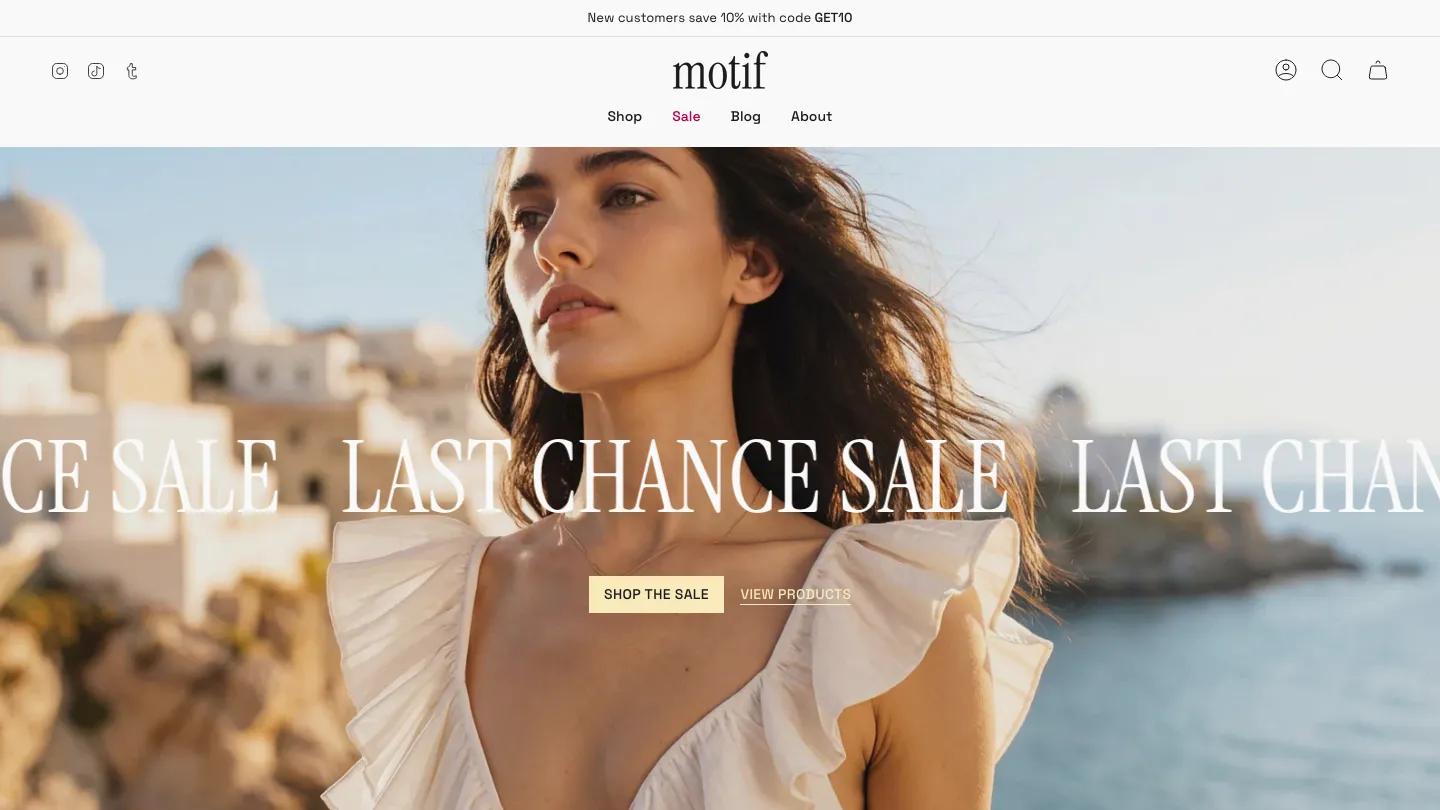
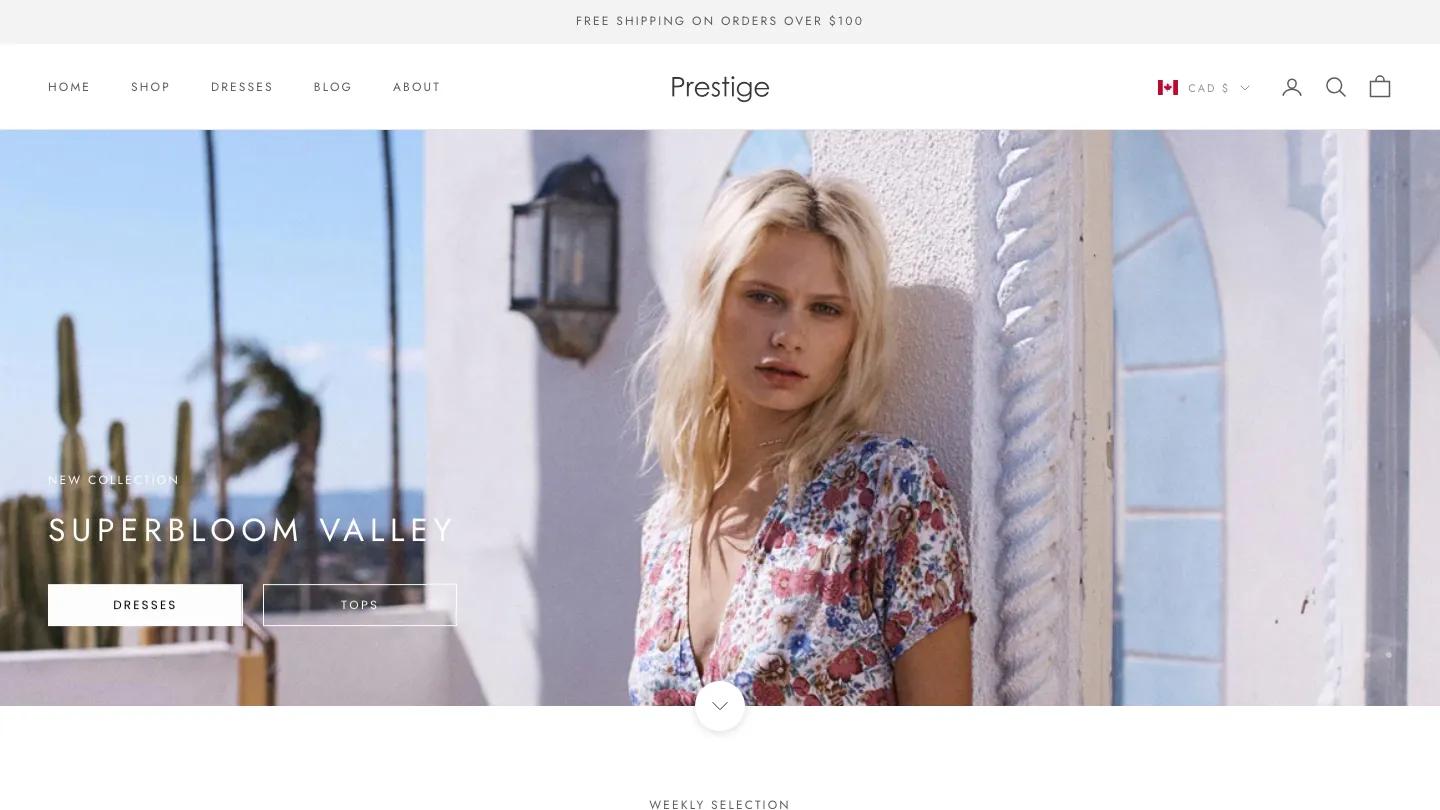
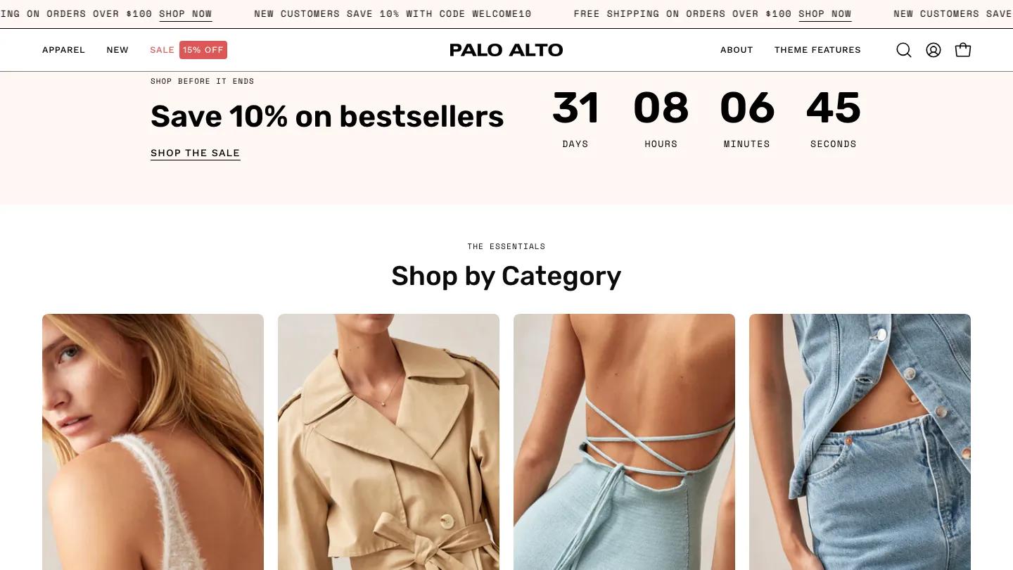
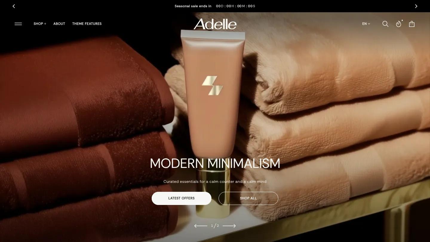
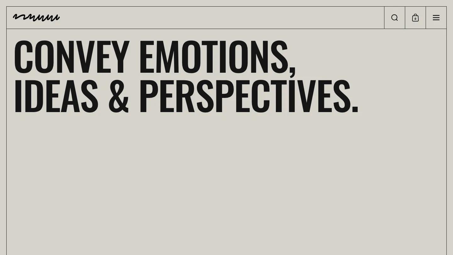
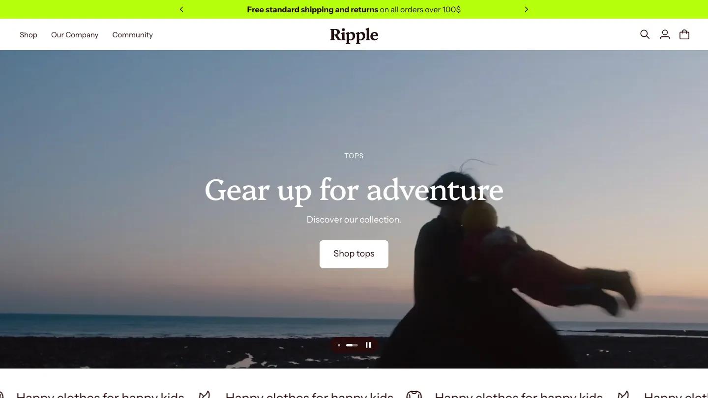
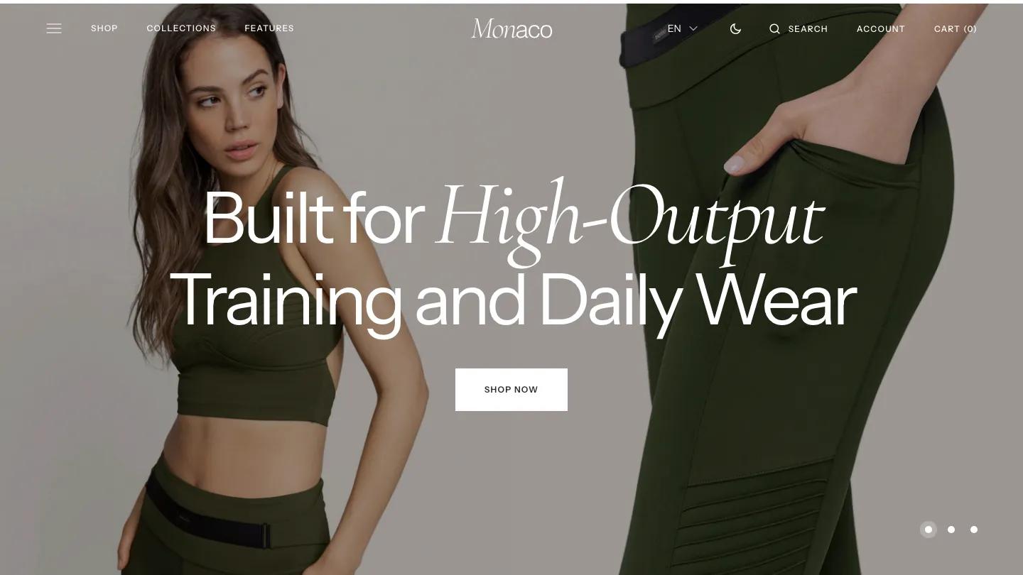
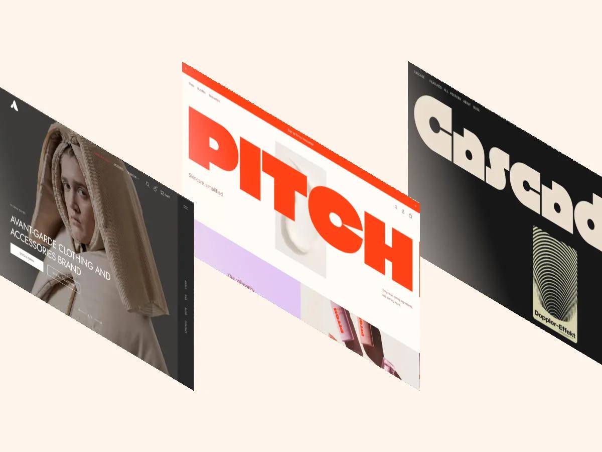
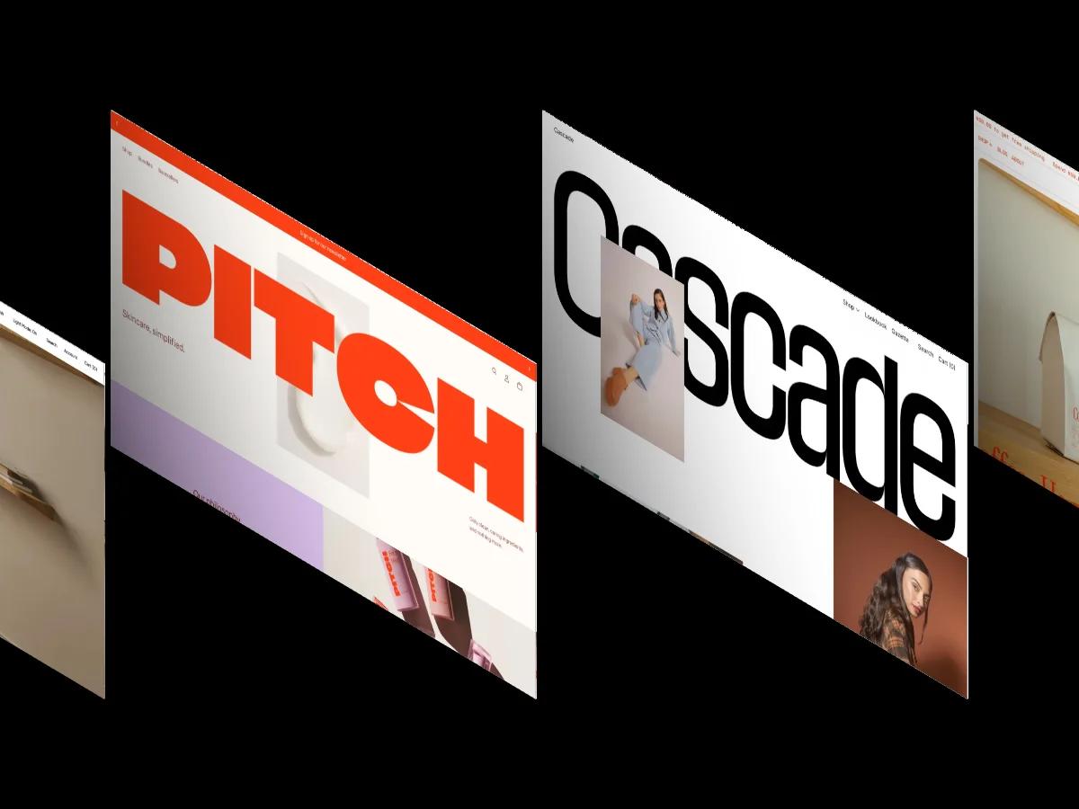
Phase is a high-quality Shopify template for Retail & E-commerce, Art & Design, Blog & Editorial, Digital Products, Fashion & Accessories by Switch.
Our Review of Phase
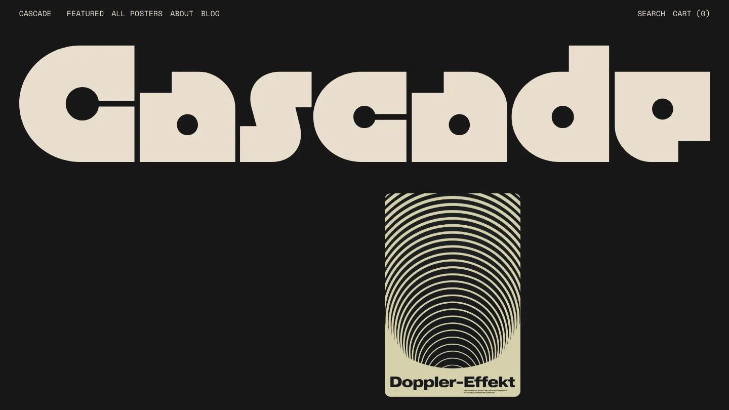
Phase is a Shopify theme from Switch built for shops that want to lead with bold, graphic typography. The homepage opens with the store name set in a heavy, geometric typeface, stacked over pink vertical bars and the word "more", all against a black background. The palette is stark: black, cream, and pink, with product images that lean into high-contrast graphic design. The monospaced Space Mono font runs throughout, reinforcing the modernist, almost Bauhaus-inspired mood.
The demo shows a poster shop with product grids, a featured collection carousel, and a blog. Navigation includes featured items, an all-products page, an about page, and blog posts. The homepage cycles through multiple product carousels, including an Arc series and a collection labeled "In Colour". Product pages offer size options, quantity controls, and a buy-it-now button alongside the standard cart. A "Seen in" section displays magazine logos in a horizontal strip. Hover effects and appear animations add movement as you scroll, and sticky elements keep navigation accessible. The demo includes a newsletter signup and search in the header.
On mobile, the layout compresses cleanly. The wordmark stacks vertically, the pink bars scale down, and the menu tucks behind a hamburger. Type remains legible, and the monospaced font holds its character at smaller sizes.
We'd pick Phase for a design-forward brand selling prints, apparel, or digital goods with a strong visual identity. The aesthetic is opinionated, so it works best when your photography or product imagery can match the graphic intensity. If your catalog needs softer colors or lifestyle photography, the dark, high-contrast layout might feel restrictive. Check that the bold type and heavy black background align with your brand before committing.
Based on the live demo, viewed on desktop and on a phone. The Design and Dev scores come from separate independent reviews. See how we score templates.
Independently evaluated by our team of 6 designers and 5 developers.











Designers score design, developers score development, and each score is the average of their independent ratings. Read about our review team and how we score templates.