Horizon is a high-quality Shopify template for Retail & E-commerce, Fashion & Accessories by Shopify.
Our Review of Horizon
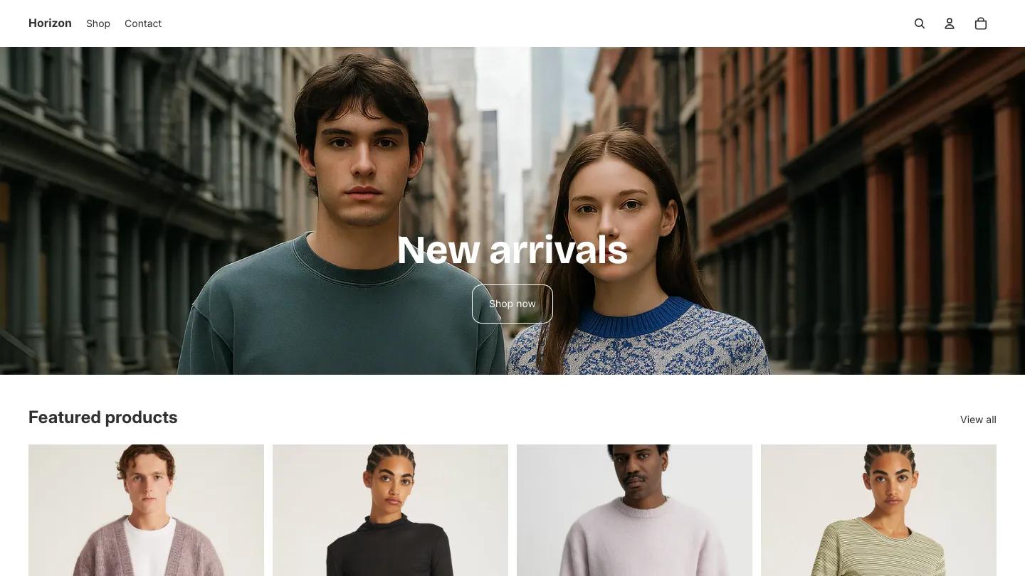
Horizon is Shopify's own flagship look, and the demo keeps it about as pared back as a clothing store can be. A wide street photo of two young models in knitwear, shot between old brick buildings, fills the hero. "New arrivals" sits dead center in heavy white Inter, with a thin outlined Shop Now button beneath it. The header is just as quiet: a bold Horizon wordmark, Shop and Contact links, and three small icons for search, account, and cart.
Below that, the homepage is essentially one product grid. Featured Products shows cardigans, turtlenecks, and striped knits in tall cards on a pale gray studio backdrop, with the name and price in small type underneath and a View All link on the right. A Join the Club block closes the page, pairing a short line about early access with a long rounded email field and an arrow button, followed by a slim footer with social icons. The product page from Shopify is where Horizon shows more personality: a two-column image grid runs edge to edge on the left, while the right column stacks a bold product name, rounded size pills, a quantity stepper beside a black Add to Cart button, and an express checkout button below.
On a phone, the hero headline stays large and centered, the menu tucks behind a hamburger next to search, and products drop into a neat two-column grid.
We'd pick Horizon for a new apparel or lifestyle brand that wants a clean, neutral starting point and plans to build sections up over time. The demo homepage is short, so expect to add your own story, category, and editorial blocks. The product page also carries a note pointing to a real clothing retailer, which needs replacing with your own copy.
Based on the live demo, viewed on desktop and on a phone. The Design and Dev scores come from separate independent reviews. See how we score templates.
Independently evaluated by our team of 6 designers and 5 developers.











Designers score design, developers score development, and each score is the average of their independent ratings. Read about our review team and how we score templates.