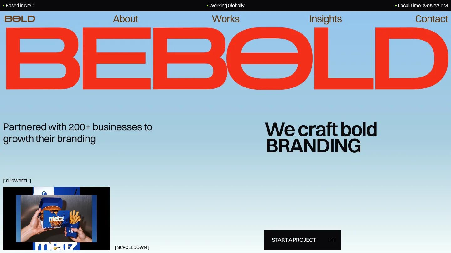
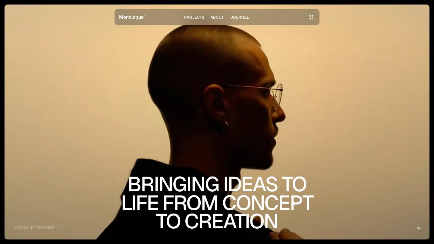
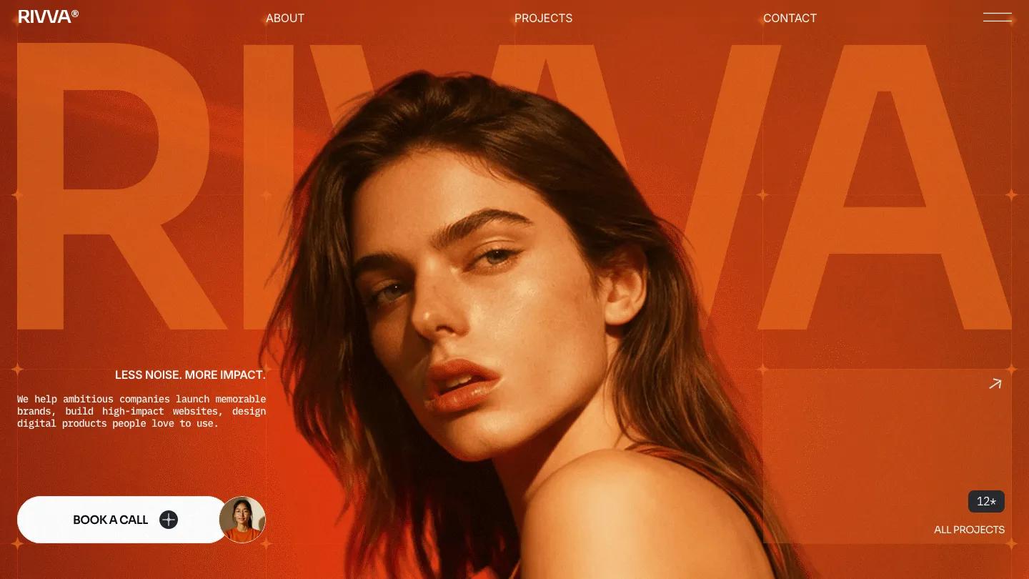
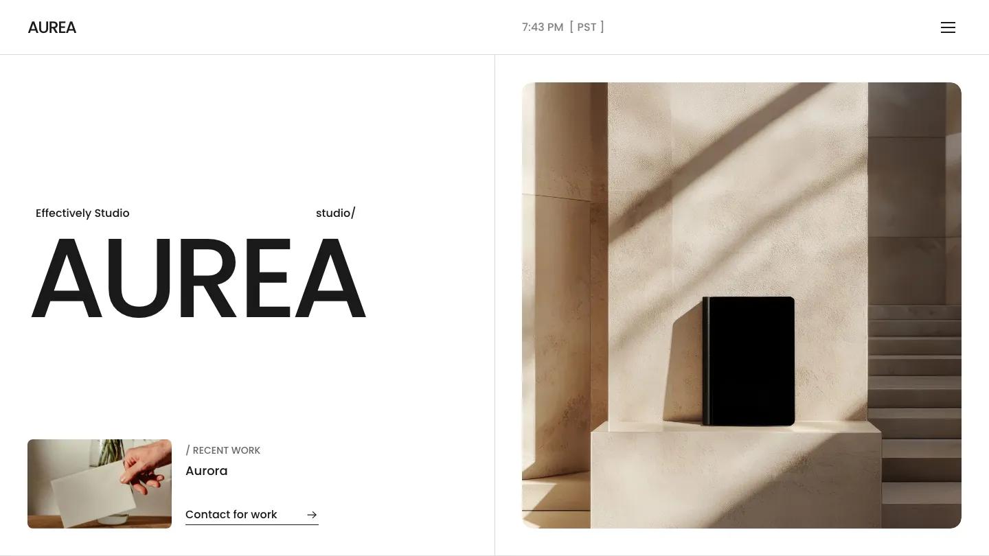
Trifecta is a high-quality Framer template for Portfolio & Agency, Professional Services, Business & Startup by Anatolii Dmitrienko.
Our Review of Trifecta
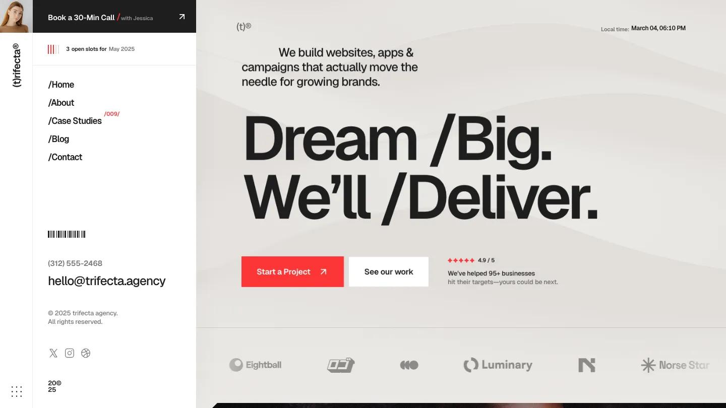
Trifecta is an agency site with a strong habit: slashes. Headings read "/Services" or "/Pricing.", menu links carry the same prefix, and the hero says "Dream /Big. We'll /Deliver." in heavy black Geist on a soft, wavy beige background. Two buttons sit underneath, a solid red-orange Start a Project and a white See our work, beside a row of small customer faces, above a strip of grey client logos. The standout is the left sidebar, which stays fixed the whole way down: a small portrait with a Book a 30-Min Call bar, an availability line with tiny red tally marks, the slash-style menu, a barcode graphic, and the phone, email, and social icons.
Anatolii Dmitrienko fills the scrolling column on the right with plenty of variety. A video panel opens on a close-up portrait with a play button, then large stat cards in three columns, featured case studies on full-bleed photos with a red Featured tag, and a scrolling wordmark band. The process section uses a big quote mark and red step labels like /Discovery, testimonials sit on a dark panel with arrow controls, and an about block arrives on a full red background. Pricing cards, an FAQ, and a red newsletter band follow. The Contact page keeps the sidebar, adds three numbered next steps, and has a form with budget options as pill-shaped radio buttons.
On a phone, the sidebar collapses into a top bar with the portrait, the call button, and a dotted menu icon, and the hero buttons go full width.
We'd pick Trifecta for small studios and freelancers who sell projects directly and want visitors to book a call fast. The homepage is very long, so cut what you don't need. Replace the demo portrait, stats, and availability month too, since they are all placeholders.
Based on the live demo, viewed on desktop and on a phone. The Design and Dev scores come from separate independent reviews. See how we score templates.
Independently evaluated by our team of 6 designers and 5 developers.











Designers score design, developers score development, and each score is the average of their independent ratings. Read about our review team and how we score templates.