Studio B is a high-quality Framer template for Portfolio & Agency, Personal, Art & Design, Professional Services, Business & Startup by ena supply.
Our Review of Studio B
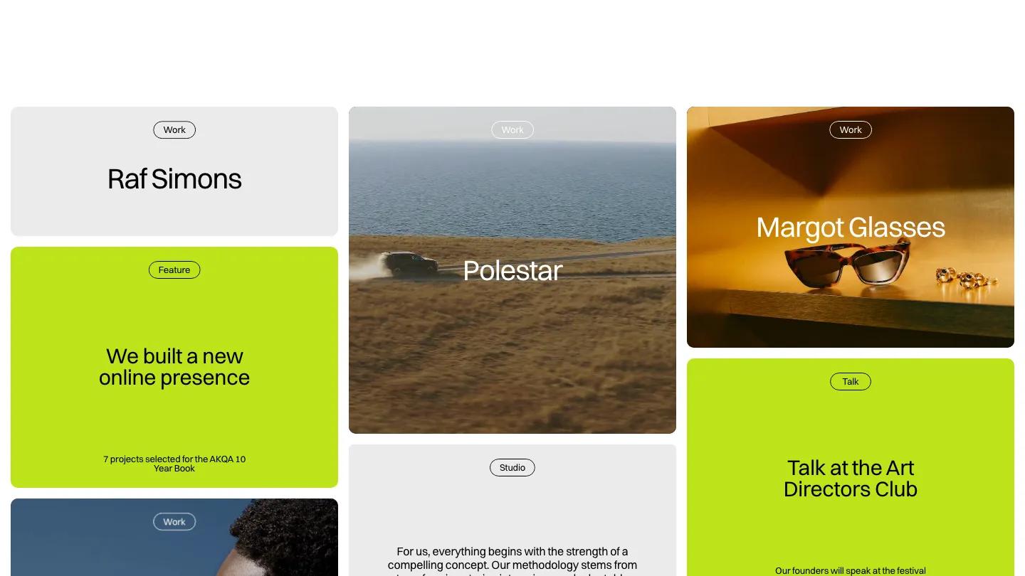
Studio B is a portfolio for a design studio that would rather show a wall of work than write a long pitch. There is no hero in the usual sense. The page opens straight into a three-column grid of rounded tiles, each topped with a small outlined pill label such as Work, Feature, Talk, or Studio. Project tiles carry full-bleed photos or video with the client name in white Switzer, while text tiles sit on pale grey or a sharp lime green. The header is a black Studio B pill plus grey pill links, with Contact picked out in lime.
The clever part is how ena supply mixes content types inside that one grid. A lime tile announces "We built a new online presence", another promotes a conference talk by the founders, a Clients tile shows a few wordmarks, and a Studio tile runs a live clock beside the city name. Further down sit a Services tile with a typing effect, an awards count, and an embedded music player under a "what we listen to" heading. The footer spells out Studio B in large dotted lettering. The Work page drops the text tiles and keeps only project cards in the same three columns.
On a phone, the grid becomes a single column of full-width tiles, the nav folds into a Menu pill, and the lime cards still break up the photos nicely.
We'd pick Studio B for small branding studios with a steady stream of projects, news, and talks to post. The demo fills the grid with famous fashion and car brand names, so swap those for your own clients first. The look also depends on striking photography in every work tile, and a thin portfolio will leave visible gaps.
Based on the live demo, viewed on desktop and on a phone. The Design and Dev scores come from separate independent reviews. See how we score templates.
Independently evaluated by our team of 6 designers and 5 developers.











Designers score design, developers score development, and each score is the average of their independent ratings. Read about our review team and how we score templates.