Innostart is a high-quality Framer template for Business & Startup, Technology & Software, Blog & Editorial by Ulvin.
Our Review of Innostart
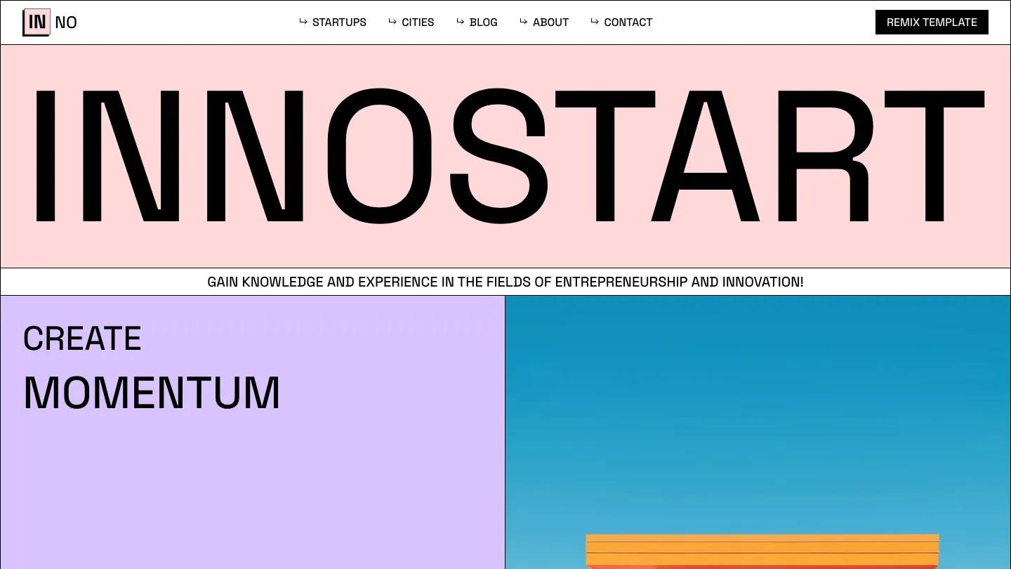
Innostart reads like a printed program for a startup accelerator, and that's the charm. Ulvin built this Framer template on a strict grid of thin black rules. The name fills the top of the page in huge Space Grotesk capitals on pale pink, a white strip of uppercase copy runs under it, and then the page splits into a lilac "Create Momentum" panel beside a photo of a candy-colored house against blue sky. Pink, lilac, mint and light gray take turns as section backgrounds, all held together by black type.
The homepage moves through a Next-Gen Builders row of startup cards, each with a soft product photo and a city, then a Regional Centers grid where four city names sit in big gray boxes with round black arrow buttons. After that comes a team list with portraits and titles on mint, a mentors and trainers table set out like a spreadsheet, a black panel of partner logos in bright accent colors, a blog grid, and a closing "Innovation, build better" scene where a loose collage of pastel photos gathers around a Get in Touch button. The startups page repeats the grid under a lilac banner. We like how the grid lines do the organizing, so very different sections still feel like one booklet.
On a 390px phone the name breaks into two stacked words, the tagline strip wraps to three lines, and the lilac panel picks up a More About Us button under the heading.
We'd pick it for an incubator, coworking network or founder community that runs programs across several locations. Before launch, swap out the AI-style product photos and the made-up startup and partner names, and remove the remix button the demo keeps in the header.
Based on the live demo, viewed on desktop and on a phone. The Design and Dev scores come from separate independent reviews. See how we score templates.
Independently evaluated by our team of 6 designers and 5 developers.











Designers score design, developers score development, and each score is the average of their independent ratings. Read about our review team and how we score templates.