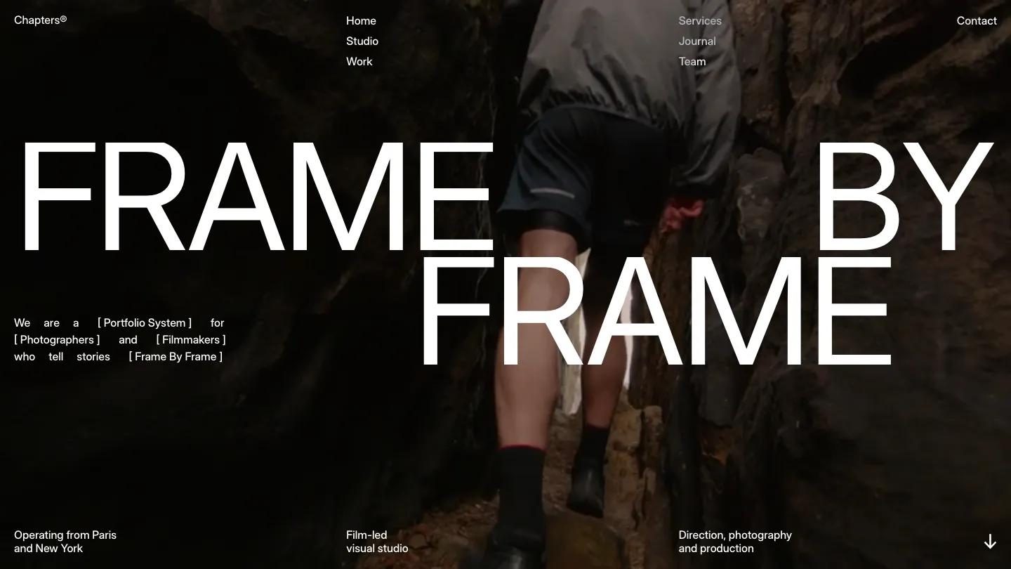
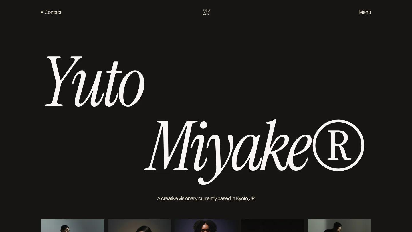
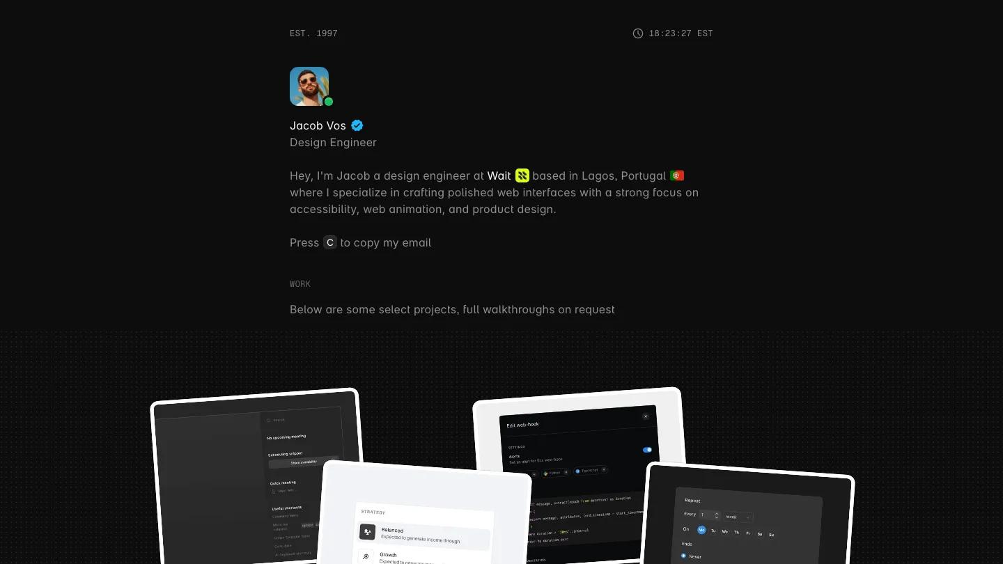
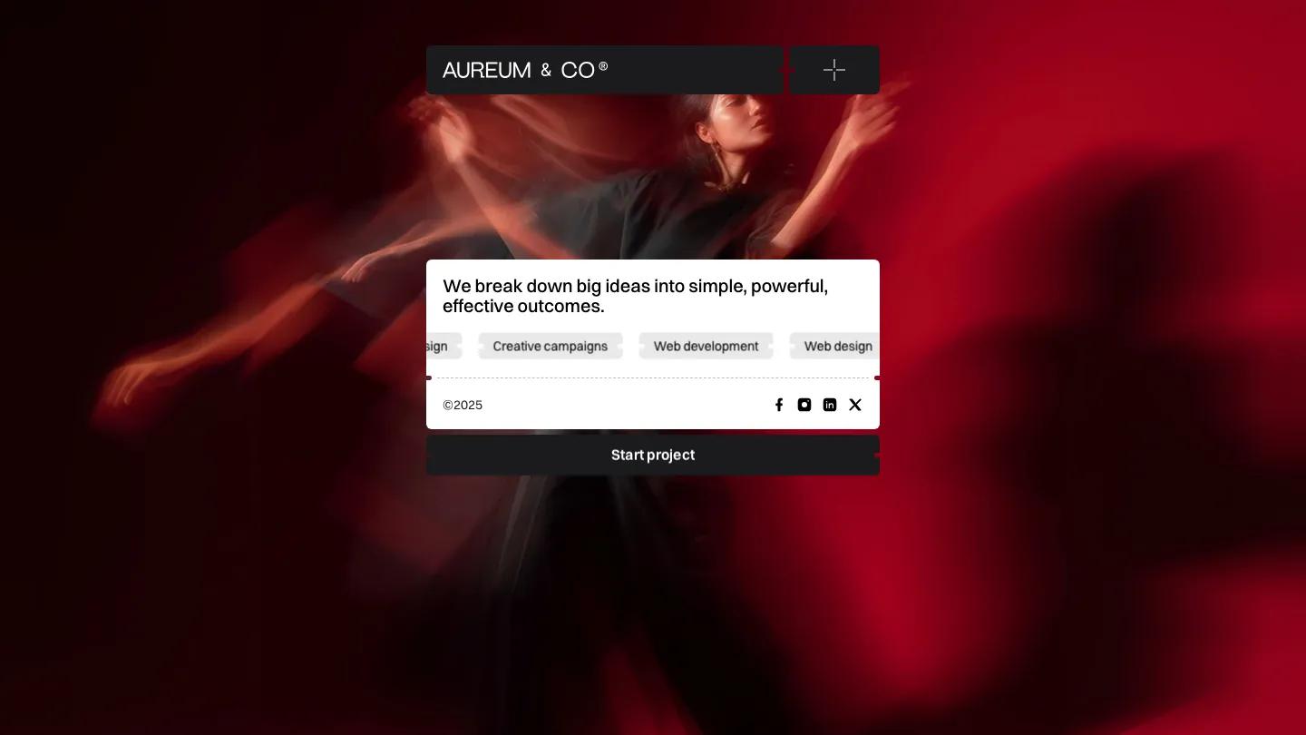
Inframez is a high-quality Framer template for Photography & Videography, Portfolio & Agency, Art & Design, Personal by okafor Ikenna.
Our Review of Inframez
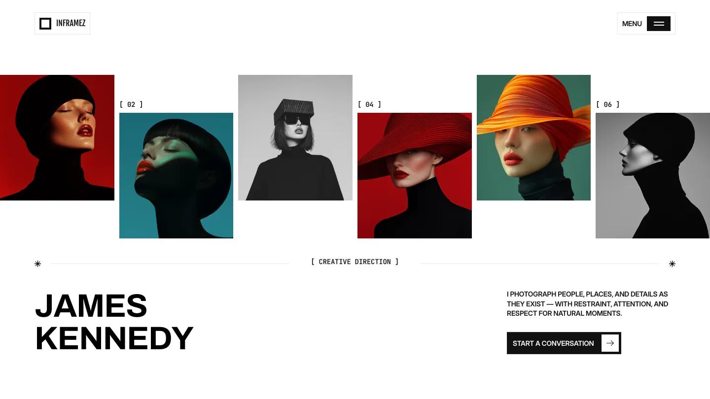
Inframez opens with a staggered strip of six fashion portraits running edge to edge, each with a small bracketed number above the gaps, and a photographer's name in heavy black Archivo capitals underneath. It's a Framer template by Okafor Ikenna for portrait and editorial photographers, and the hero copy is short: one line about photographing people and moments, plus a Start a Conversation button with a boxed arrow. Small monospaced labels in square brackets tag every section, which gives the whole site a contact sheet feel.
The page alternates between white and near-black. A My Philosophy block leads into Selected Works, a two-column grid where each project shows a title, city and year. What I Do switches to black and lists services as rows: a heading and a line of copy on the left, a tall photo in the middle, and a session type label on the right. From the Archive stacks tilted prints between two halves of the heading, then Behind the Lens pairs a portrait with a neat list of experience, location and focus. Client feedback, a journal list with Read Blog buttons, and a dark contact form over a fine wave pattern finish it off. Project pages carry a big title, a short statement and a spec list covering location, category, role and camera. We like that camera line: it's a small detail that other photographers and art directors actually look for.
On a 390px phone the portrait strip stays as a staggered row, and the name, intro and button center below it.
We'd pick Inframez for a fashion or editorial photographer with a consistent, color-graded body of work. Think about your own images first: the layout is built around saturated, studio-lit portraits, and softer documentary or wedding work may look flat against those black sections.
Based on the live demo, viewed on desktop and on a phone. The Design and Dev scores come from separate independent reviews. See how we score templates.
Independently evaluated by our team of 6 designers and 5 developers.











Designers score design, developers score development, and each score is the average of their independent ratings. Read about our review team and how we score templates.