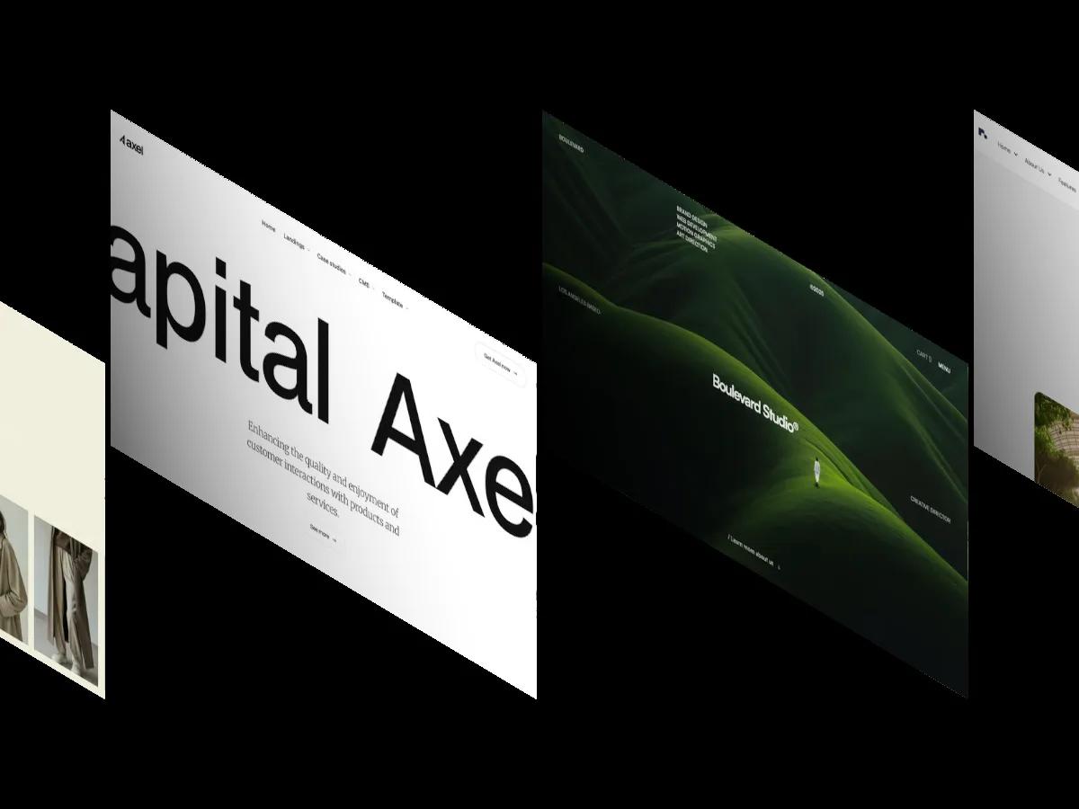
Tokko is a high-quality Webflow template for Personal, Education & Training, Business & Startup, Technology & Software by NutsDev.
Our Review of Tokko
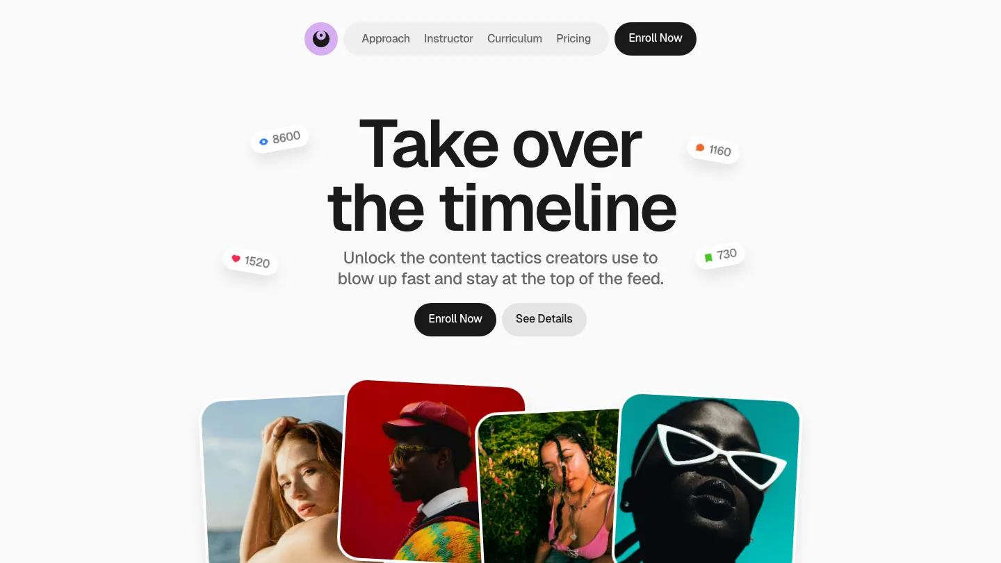
Tokko is a one-page sales site for an online course, built for creators and coaches who teach social media growth. The hero says "Take over the timeline" in heavy black Geist on an off-white page, with small floating pills showing view, like, comment and save counts around the headline. Below the buttons, a row of tilted portrait cards in saturated reds and teals adds the color the rest of the page holds back. Navigation sits in a floating grey capsule with Approach, Instructor, Curriculum and Pricing, flanked by a lilac eye logo and a black Enroll Now pill.
NutsDev mixes card styles to keep the page moving. "You'll love this course" opens with tall photo cards like Growth that pops, lit in moody red or neon pink with captions over the image. "The system that works" turns its benefits into rounded pills with blue icon circles, from No Guesswork to Smart Posting. My story pairs an instructor portrait with a white bio card, then the curriculum splits into Foundation, Content and Momentum columns with numbered lesson lists and small theme chips. Testimonials land as a scattered pile of white cards, followed by an Included in the course grid, Core, Plus and Max pricing cards, an accordion FAQ, and a Plan better, Post smarter closing panel.
On a phone, the capsule menu folds into a black hamburger button, the hero buttons go full width, and the floating counters overlap the headline, which is charming but slightly crowds the words.
We'd pick Tokko for creators selling a single course or cohort program who want an upbeat, social-first page. The homepage runs very long, so trim anything you can't fill with real lessons and real student quotes. The testimonial names are placeholders, and the guarantee wording near pricing should match your actual terms.
Based on the live demo, viewed on desktop and on a phone. The Design and Dev scores come from separate independent reviews. See how we score templates.
Independently evaluated by our team of 6 designers and 5 developers.











Designers score design, developers score development, and each score is the average of their independent ratings. Read about our review team and how we score templates.