Nuanced is a high-quality Webflow template by Margined.
Our Review of Nuanced
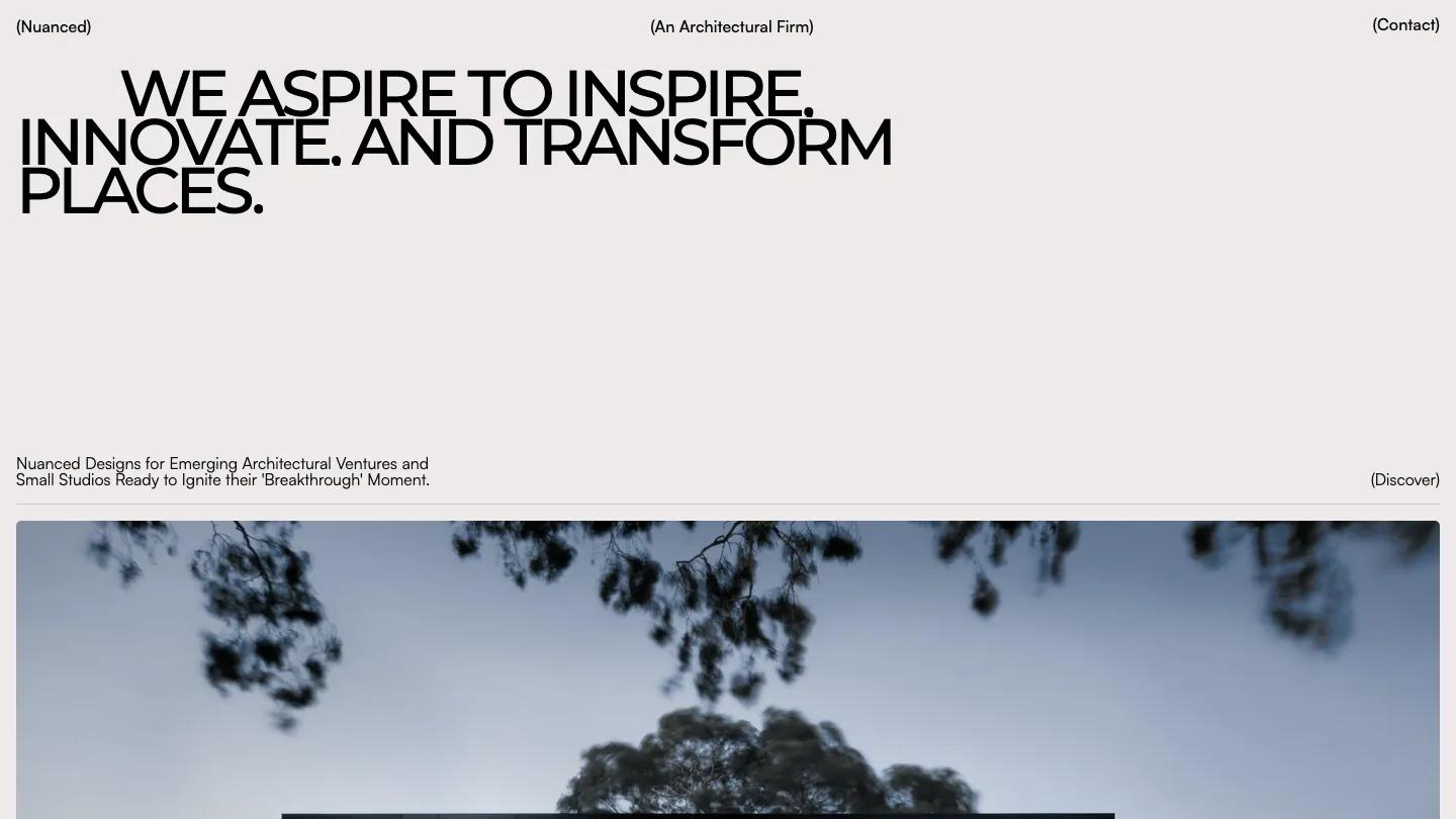
Nuanced is a one-page site for a small architecture practice, and it leans hard on restraint. The hero is pure type: "We aspire to inspire. Innovate. And transform places." set in heavy uppercase Montserrat, tightly leaded and indented on the first line, on a warm off-white page. A short line underneath pitches the studio to emerging architectural ventures, with a quiet (Discover) cue on the right. The header is three bracketed labels, the studio name, (An Architectural Firm) in the middle, and (Contact) on the right, and that is the whole menu.
Margined builds the rest of the homepage as a stack of projects. Each one is a full-width photo with gently rounded corners, mostly dusk shots of modern houses with lit windows, captioned underneath with the project name in caps and a bracketed number like (01). A (Who we are) block follows with a right-aligned statement heading and four values, Visionary, Client-Centric, Innovation, and Attention-to-Detail, laid out as ruled rows with a number, a title, and a short paragraph. The footer sets the studio name large, adds a phone number and email, and links to style guide, license, and changelog pages.
On a phone, the headline wraps to five tight lines and keeps its weight, but a large empty gap opens before the intro text and the first project photo.
We'd pick Nuanced for a small architecture or interior studio with a handful of excellent project photos and no need for more than a calling card. The whole page depends on that photography, so dim or amateur shots will show immediately. There is no menu beyond Contact and no services or team section, and the values copy is generic, so plan to rewrite it in your own voice.
Based on the live demo, viewed on desktop and on a phone. The Design and Dev scores come from separate independent reviews. See how we score templates.
Independently evaluated by our team of 6 designers and 5 developers.











Designers score design, developers score development, and each score is the average of their independent ratings. Read about our review team and how we score templates.