Kora is a high-quality Webflow template for Retail & E-commerce, Beauty & Personal Care by JUNO.
Our Review of Kora
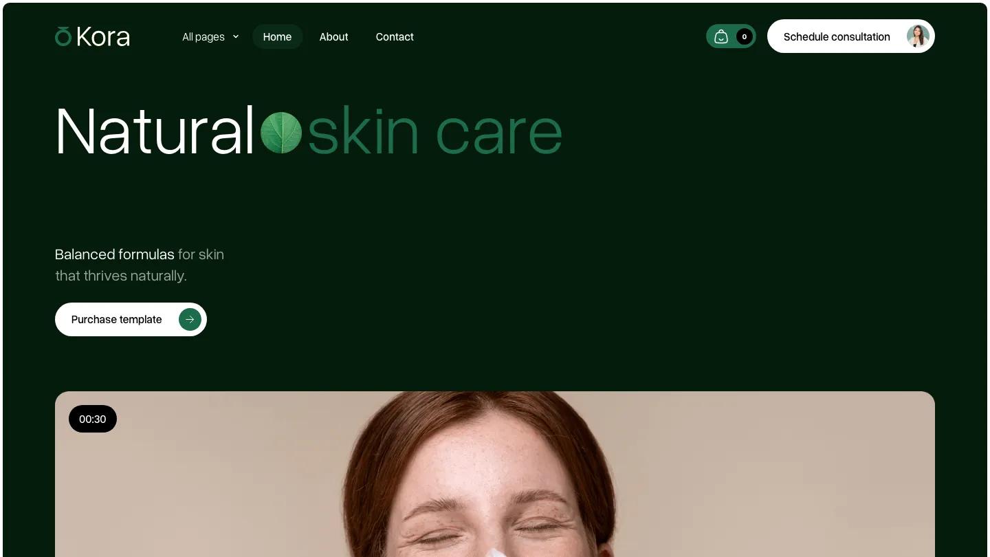
Kora is a skincare store for a small natural beauty brand, and it opens on a near-black green that feels more apothecary than spa. "Natural skin care" runs across the top in light Overused Grotesk, with "skin care" in a softer green and a round leaf photo set between the words like a punctuation mark. Under a short line about balanced formulas sits a white pill button, and below that a wide rounded video card of a laughing woman with cream on her nose with a small timer badge. The header keeps a pages dropdown and a few links on the left, then a green cart pill and a white Schedule Consultation button with a tiny avatar.
JUNO alternates dark green panels with cream and white ones as you scroll. A row of skin concern cards labels portraits with Dryness, Redness, and Flakiness, then an FAQ pairs a serum bottle photo with a numbered accordion. A dark band titled "Natural care, radiant skin" lists brand values with check icons beside two pill-shaped photos, and a testimonial slider follows with round arrow buttons. Feature cards in green and sage carry a starburst badge, and a "Love Your Skin" banner with a jade gua sha photo closes the page above a newsletter footer. The alternate homepage flips the layout into a split hero, with that gua sha portrait on the left and the headline on white.
On a phone, the headline wraps neatly, the leaf stays tucked between the words.
We'd pick Kora for indie skincare and clean beauty brands selling a short product line. Swap every Purchase Template button for your own shop links first. We would also drop the third-party badge and the No. 1 claim unless you can back them up.
Based on the live demo, viewed on desktop and on a phone. The Design and Dev scores come from separate independent reviews. See how we score templates.
Independently evaluated by our team of 6 designers and 5 developers.











Designers score design, developers score development, and each score is the average of their independent ratings. Read about our review team and how we score templates.