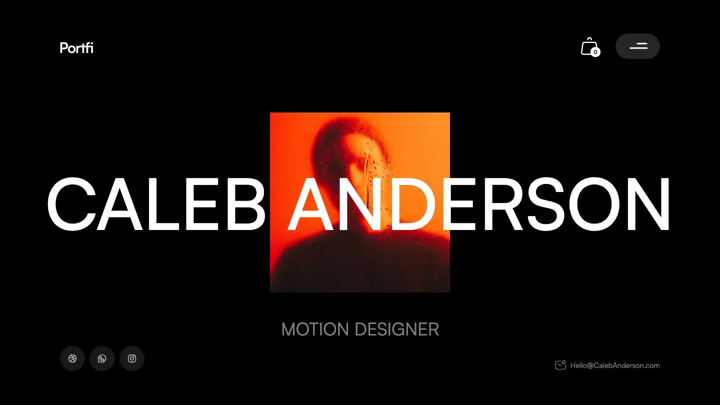
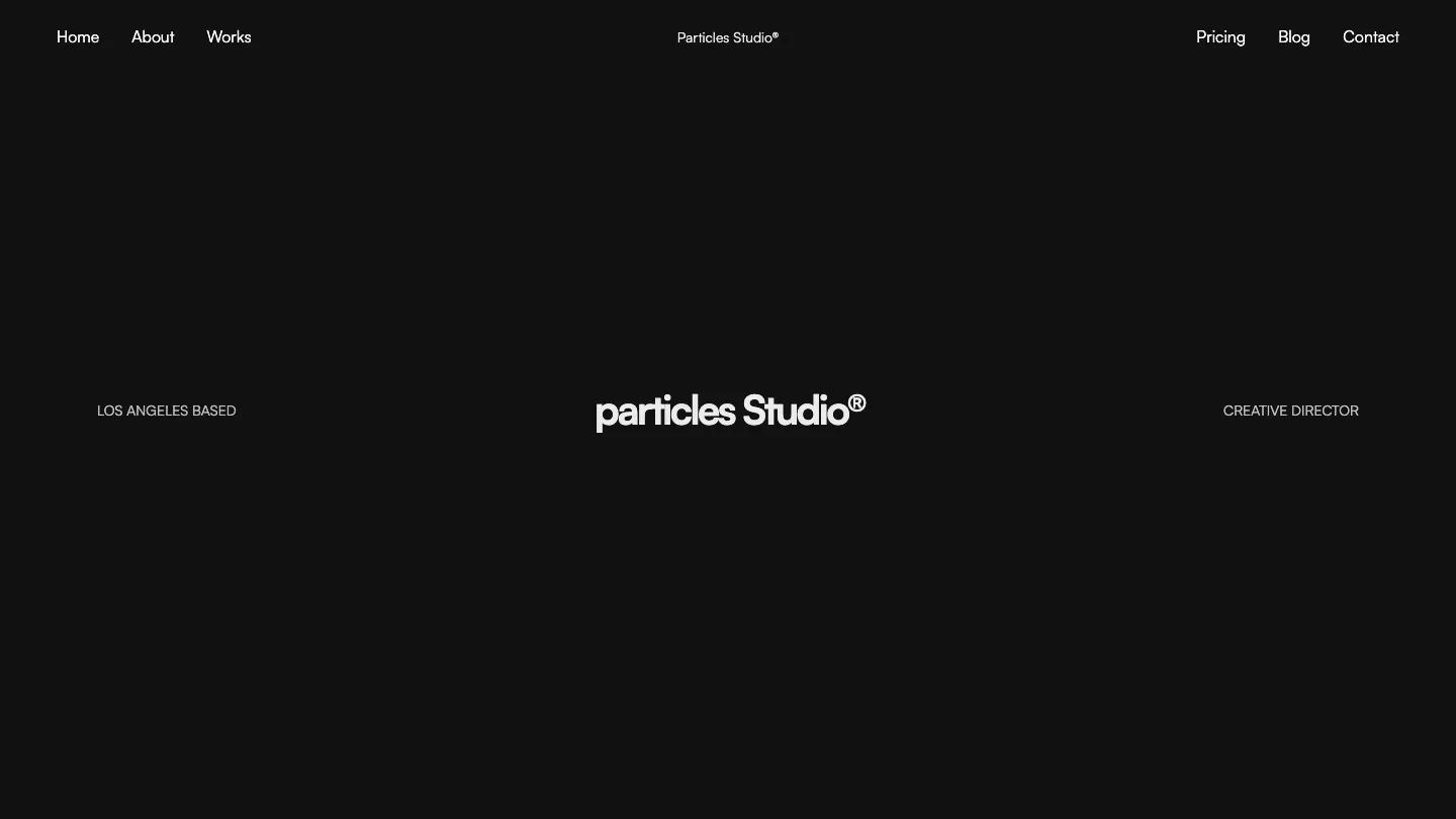
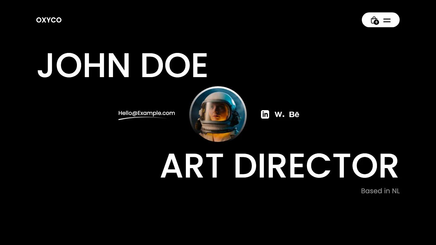
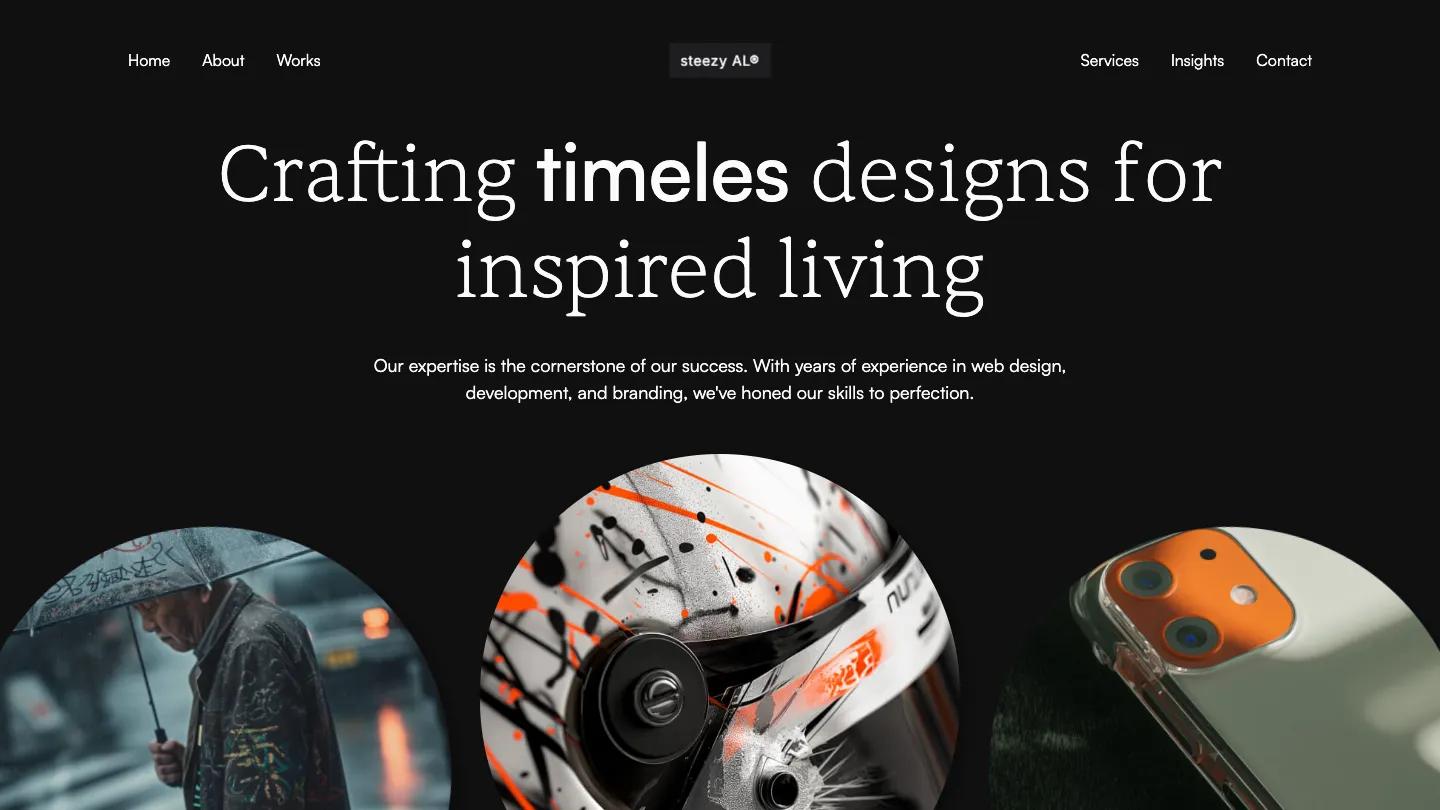
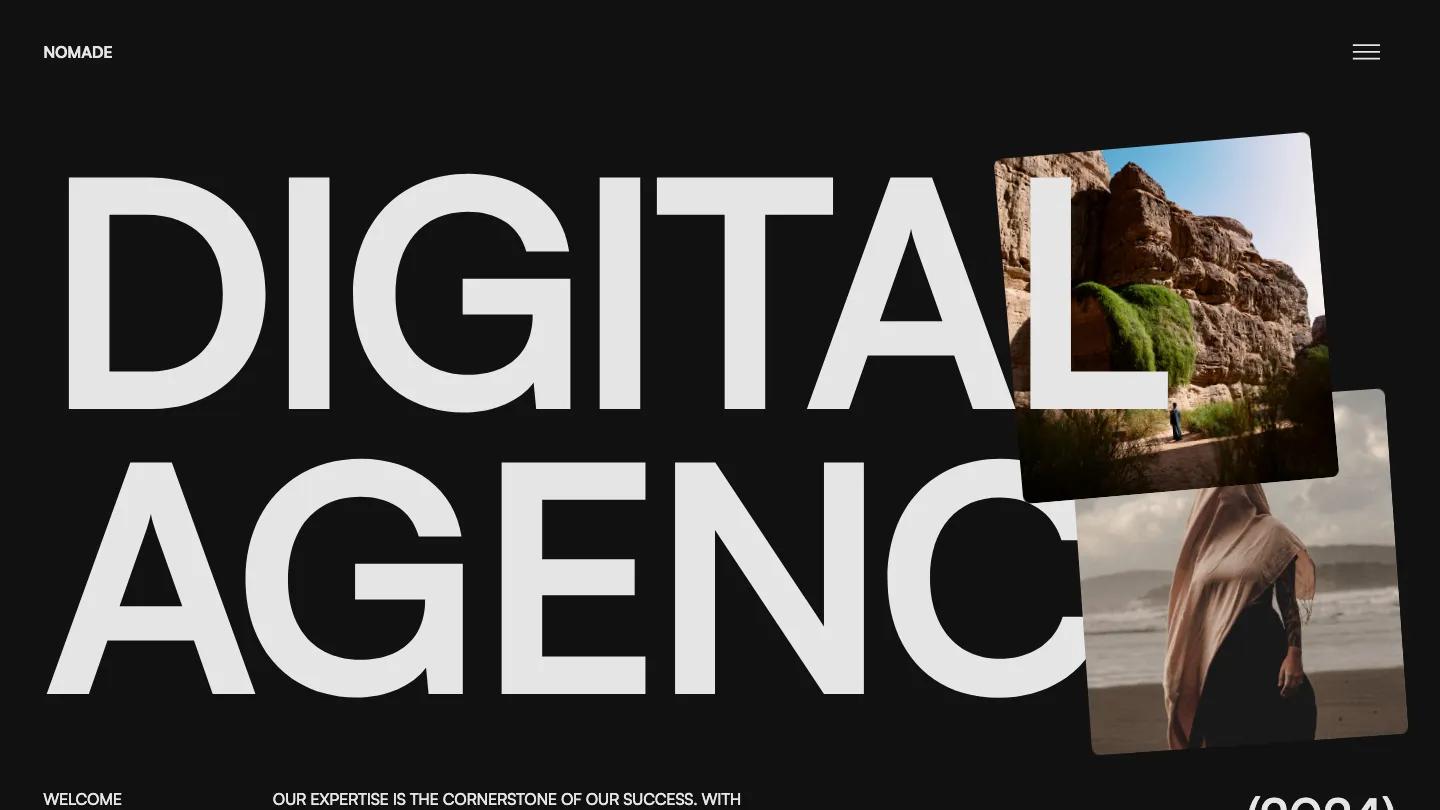
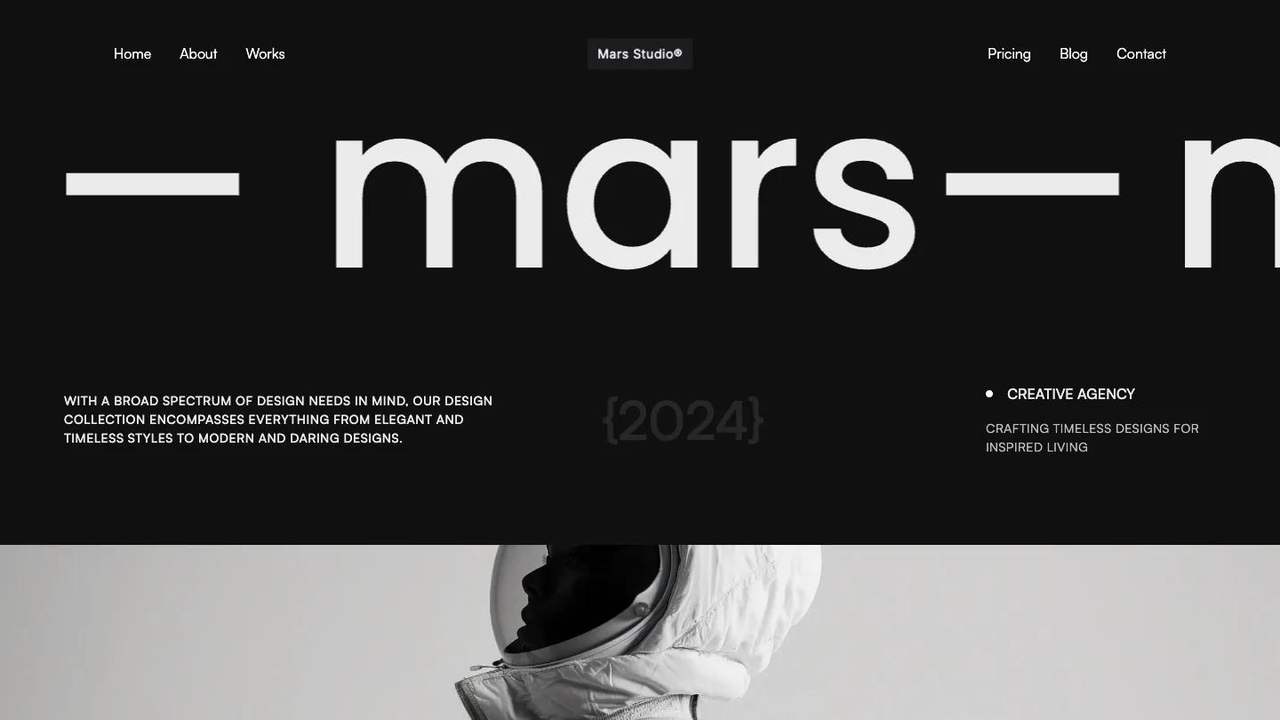
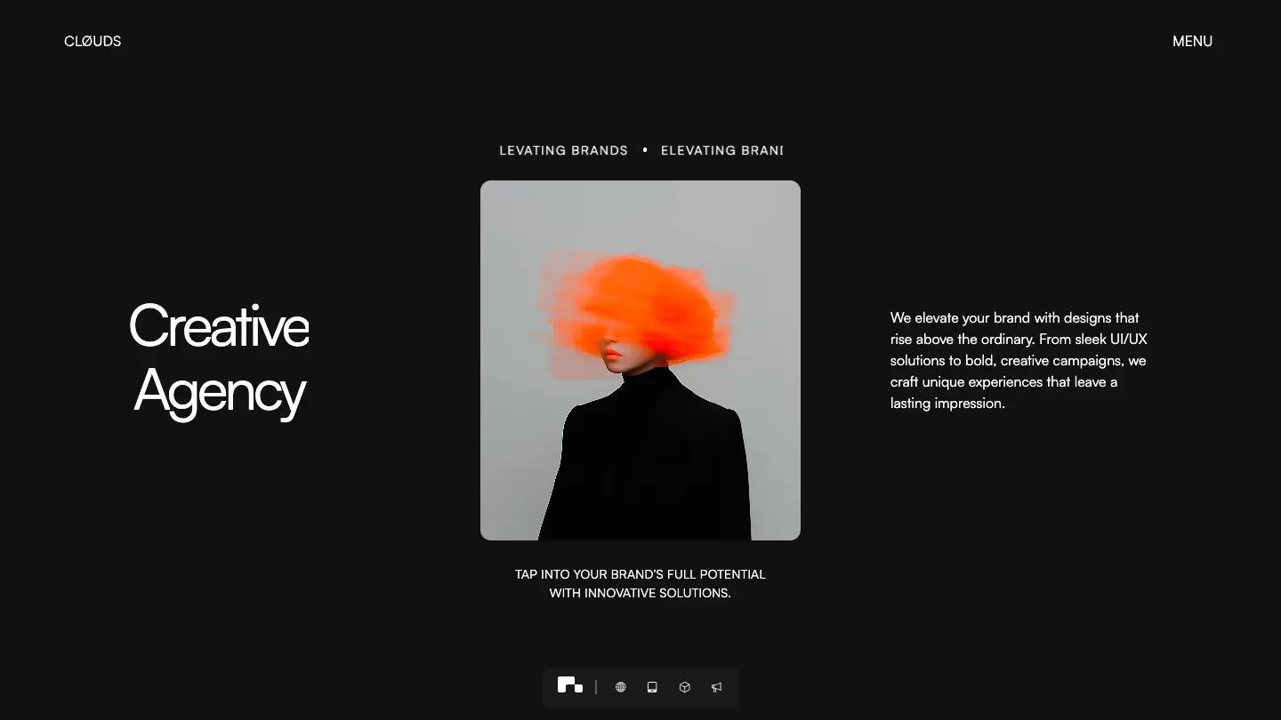
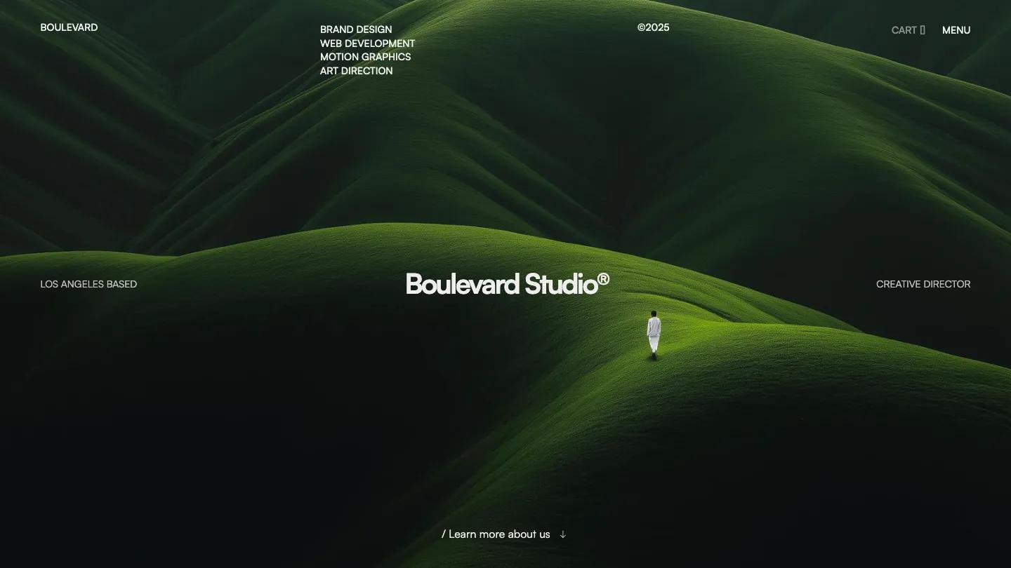
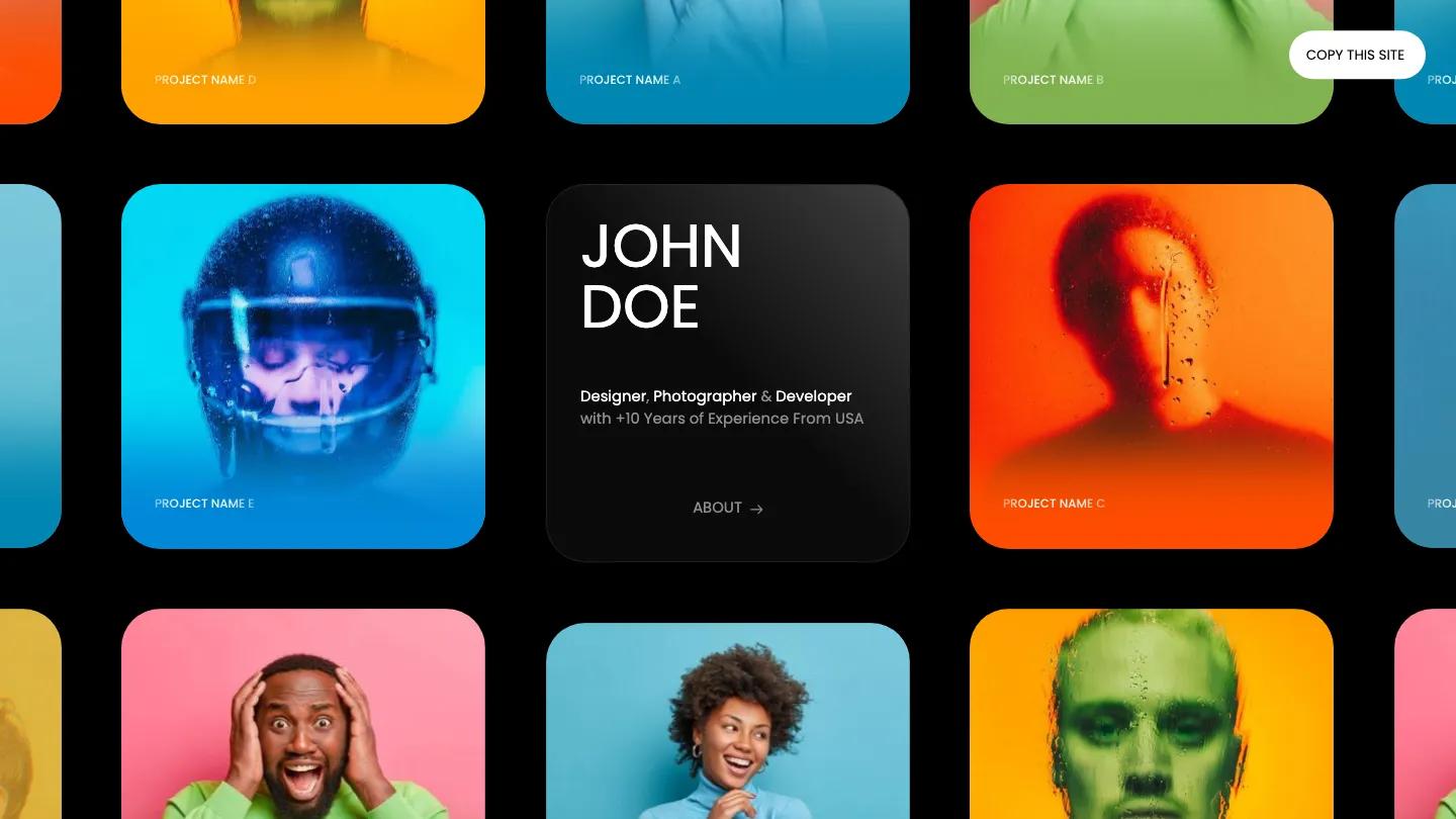
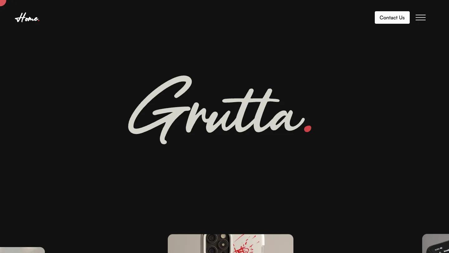
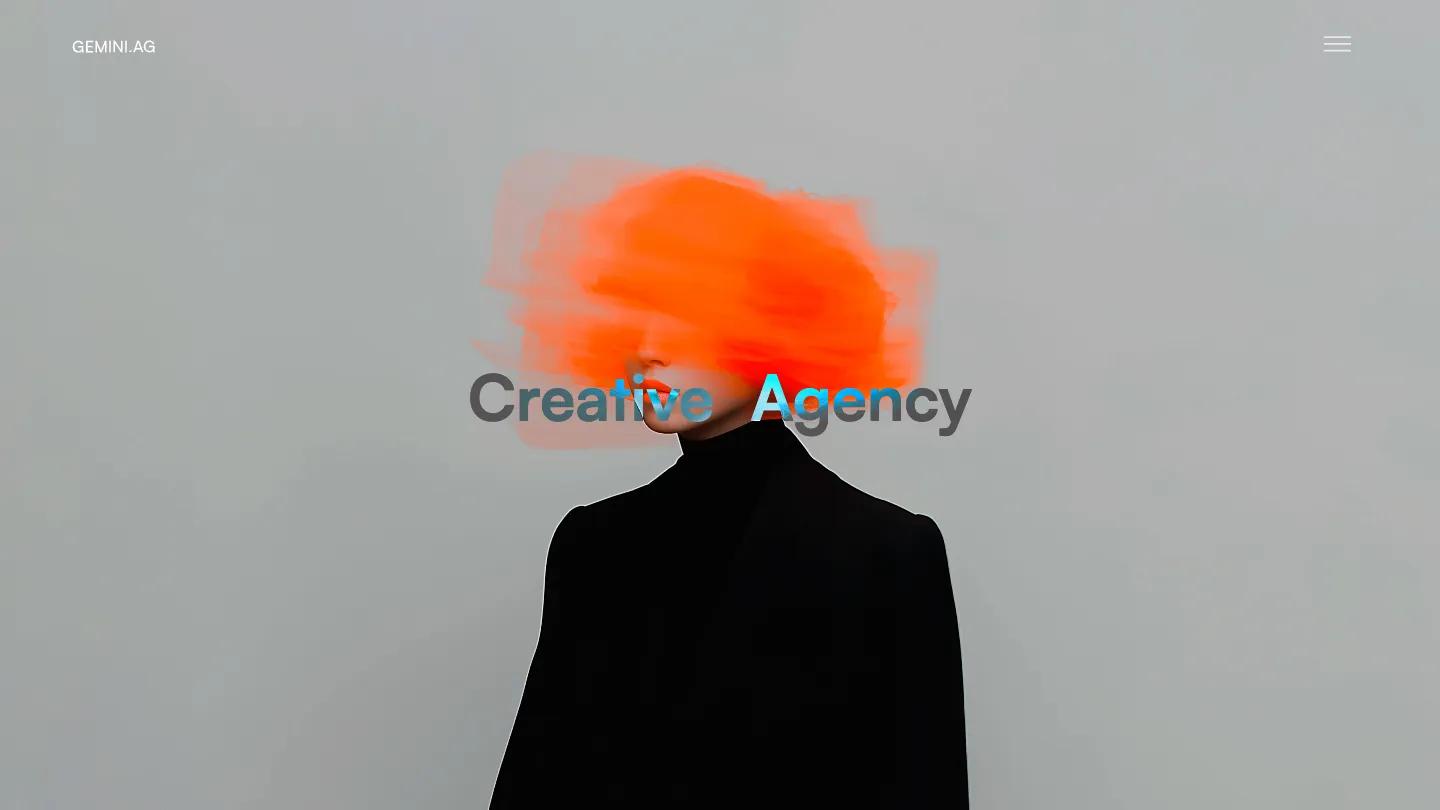
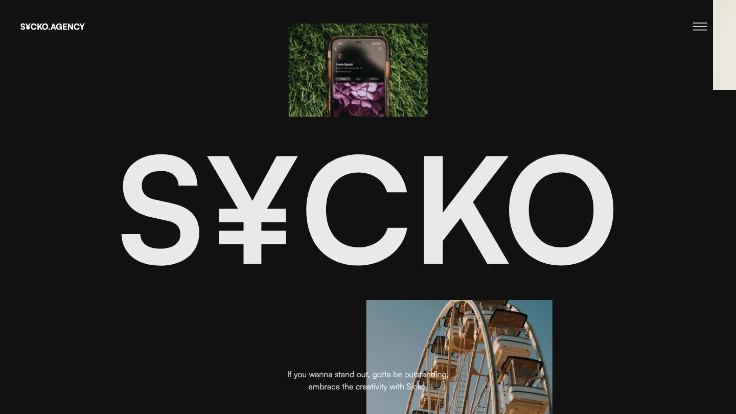
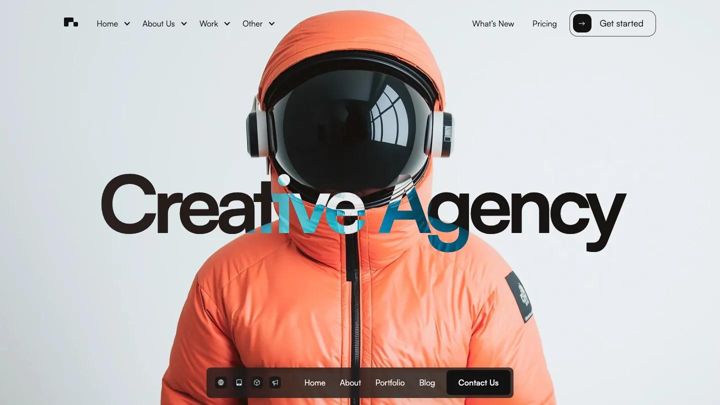
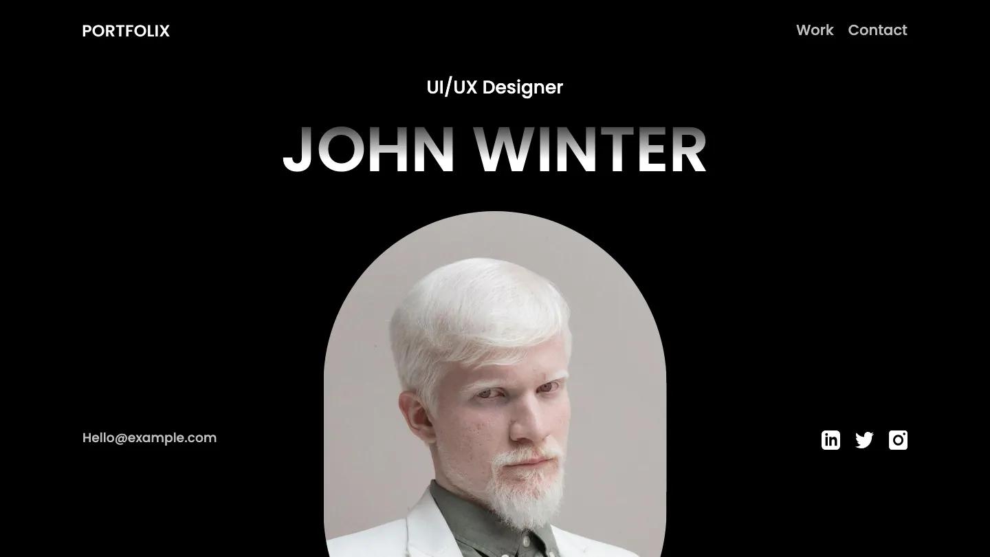
Kendrick is a high-quality Webflow template for Portfolio & Agency, Personal, Professional Services, Art & Design, Photography & Videography by Lucas Gusso.
Our Review of Kendrick
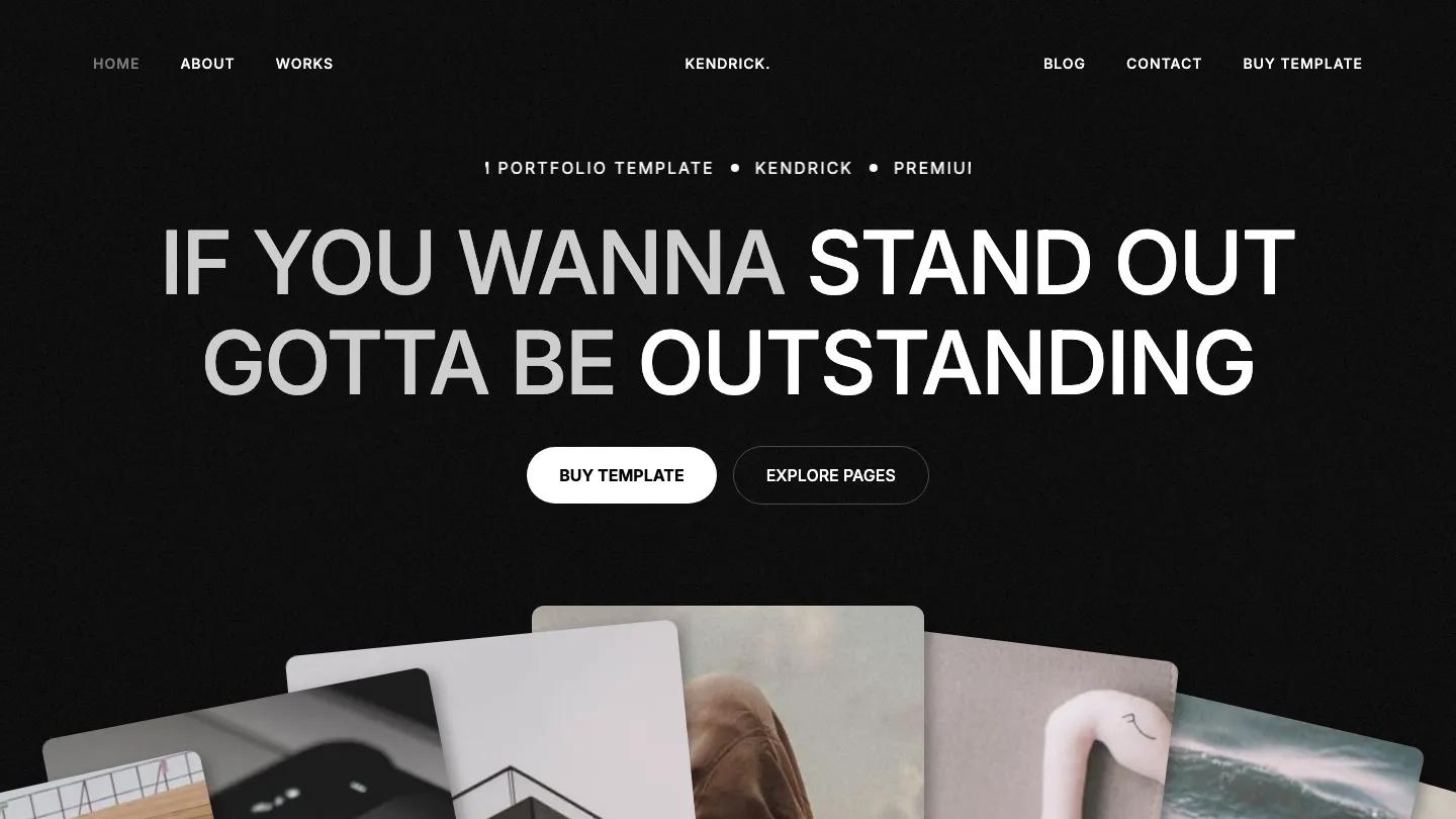
Kendrick is a dark portfolio for designers and small creative agencies, and its demo homepage doubles as a showroom for the template. Everything sits on a lightly grained near-black background in white Inter. A ticker reading "Premium Portfolio Template" scrolls above the headline, "If you wanna stand out, gotta be outstanding", set in big capitals with the key words in bright white and the rest in grey. Under it, a fan of rounded photo cards spreads across the screen. The header splits Home, About and Works on the left from Blog and Contact on the right, with the wordmark centered.
Further down, the homepage becomes a catalog of the layouts Lucas Gusso has built. About, Work, and Contact layouts each get a row of preview cards with white pill labels, so you can compare a stats strip, a numbered "Our process" list, or a grid of team portraits. The contact versions share the line "Good things happen when you say Hey", set beside a photo or above a plain name, email and message form. Buyers launch from one of the home variants rather than this showroom. The About page opens with "About Us" in heavy capitals and a large-type intro pushed into the right column.
On a phone, a hamburger icon replaces the split menu, the headline stacks over five lines with its grey and white contrast intact, and both buttons stretch to full width.
We'd pick Kendrick for designers, photographers, and small studios who want a moody, monochrome site. The demo copy leans on hype lines about leaving competitors in the dust, so plan to rewrite it in your own voice. The palette also depends on muted, high-quality photography, and bright product shots would fight with all that grey.
Based on the live demo, viewed on desktop and on a phone. The Design and Dev scores come from separate independent reviews. See how we score templates.
Independently evaluated by our team of 6 designers and 5 developers.











Designers score design, developers score development, and each score is the average of their independent ratings. Read about our review team and how we score templates.