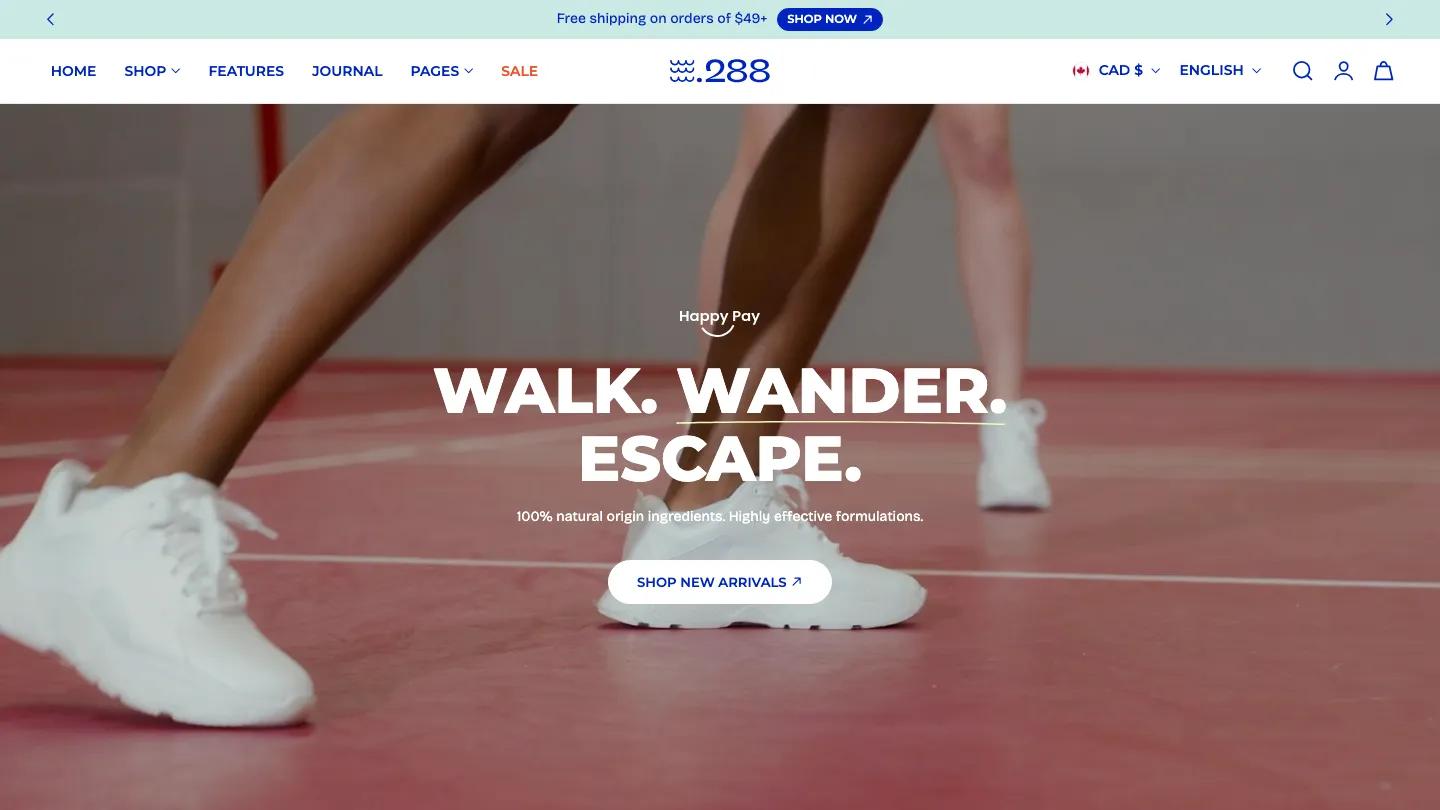
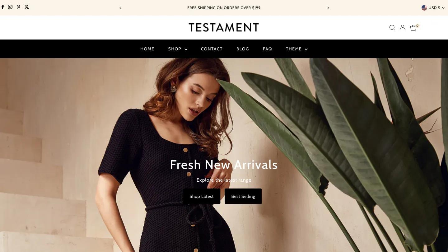
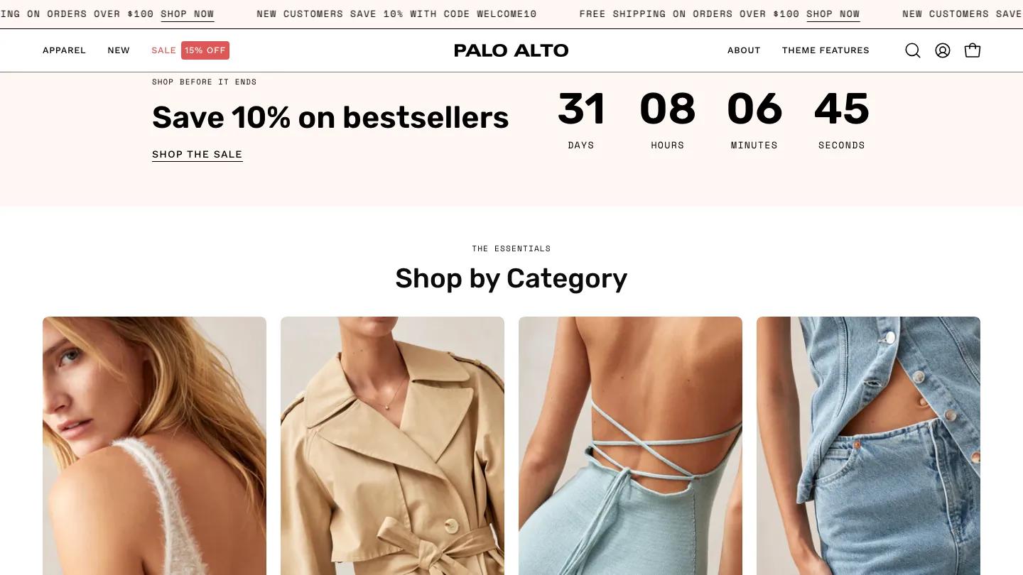
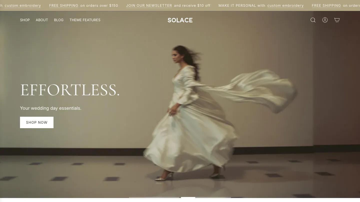
Minimalista is a high-quality Shopify template for Retail & E-commerce, Furniture & Interior Design, Blog & Editorial, Fashion & Accessories, Art & Design by Segment.
Our Review of Minimalista
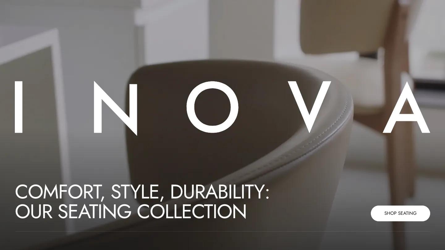
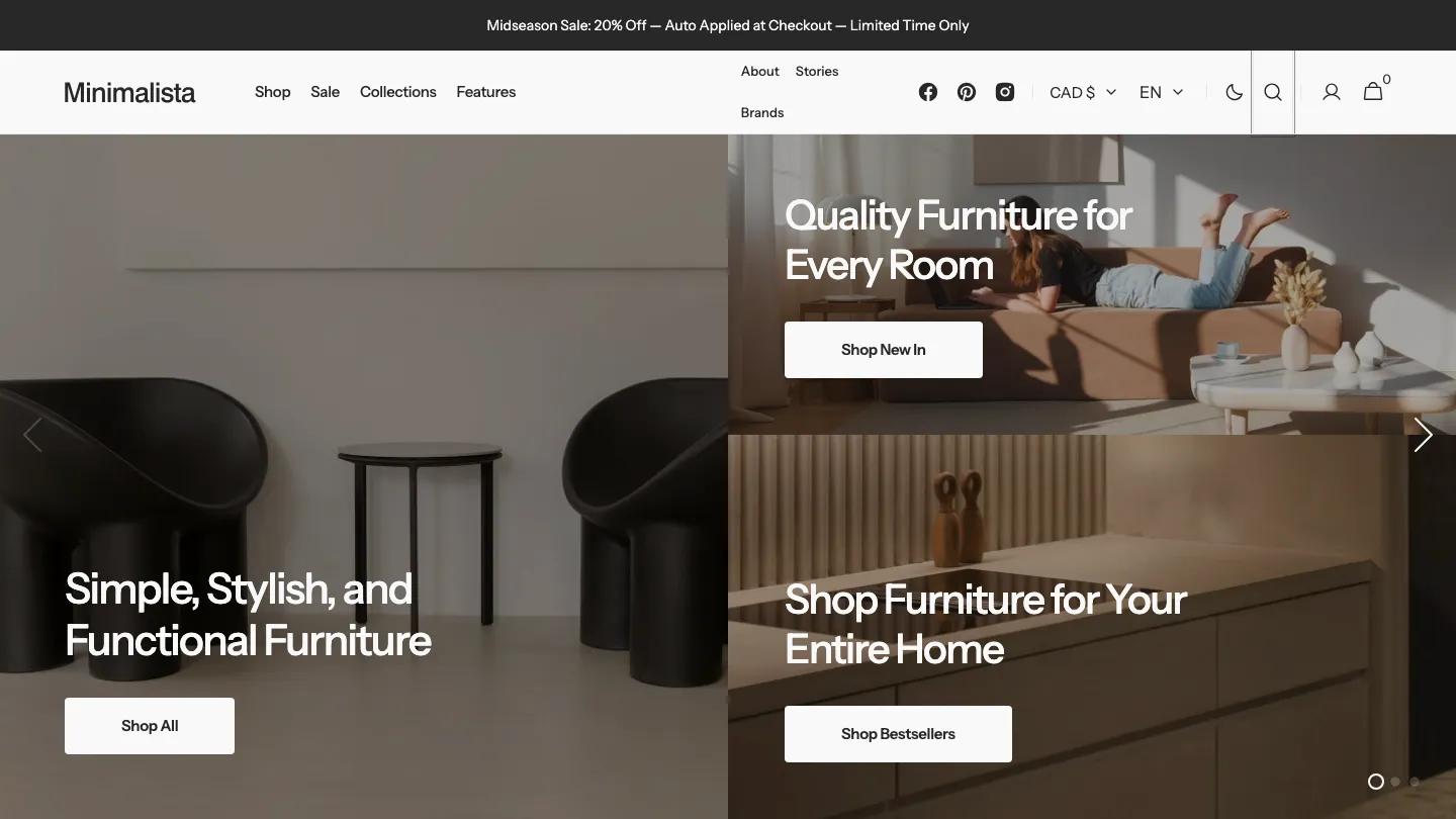
Minimalista is a Shopify theme by Segment, demoed as a modern furniture store. The palette is quiet and earthy: soft grays and off-whites, with olive green, sage and slate coming from the products themselves, set in Instrument Sans. The hero isn't a single banner but a slideshow of three tiles, one tall photo on the left and two stacked on the right, each with its own short headline and white button, so three collections get a spot above the fold at once.
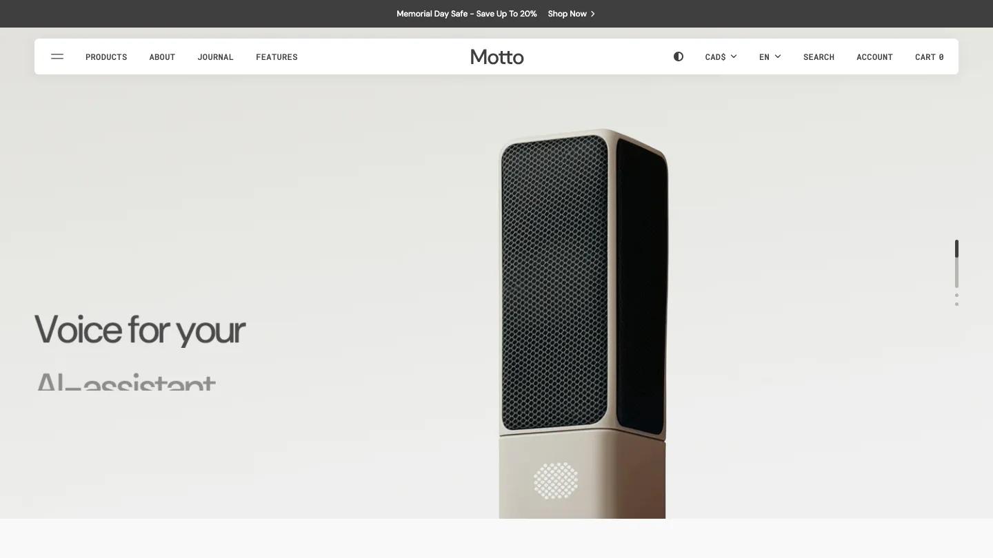
Our Bestsellers shows products on pale gray cards with a small brand label and New or Sold Out badges, then a tabbed block that switches between three featured sets with lifestyle photos underneath. After a sale banner, Shop by Category puts chairs, sofas, tables, planters and lighting on matching gray tiles, then come a lookbook, a full-width video about the brand with play and mute controls, a stories row, an FAQ and an Instagram strip. The header adds currency and language pickers and a dark mode toggle. On the product page you get a brand label, price, a green stock badge, color swatches, and both Add to Cart and Buy It Now. We like the consistent gray product tiles: cut-out furniture shots line up neatly across every grid.
On a 390px phone the hero becomes one panel with its headline and button, and the header trims down to a menu icon, the logo, search and cart.
We'd pick Minimalista for a furniture or home decor shop with a broad catalog sorted into clear categories. Plan your photography carefully, because the gray product cards only look this tidy with consistent cut-out shots.
Based on the live demo, viewed on desktop and on a phone. The Design and Dev scores come from separate independent reviews. See how we score templates.
Independently evaluated by our team of 6 designers and 5 developers.











Designers score design, developers score development, and each score is the average of their independent ratings. Read about our review team and how we score templates.