Display is a high-quality Shopify template for Retail & E-commerce, Furniture & Interior Design, Blog & Editorial by Switch.
Our Review of Display
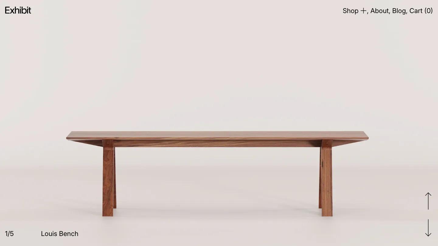
Display is a modern furniture and home goods theme from Switch that opens with a full-screen product shot and a simple top navigation. The hero shows a walnut bench against a soft beige backdrop, and the site stays in that quiet, gallery-like register throughout. The type is Inter, used large for product names and small for navigation, all in black on off-white. The homepage scrolls through category cards (storage, tables, beds), a horizontal product grid with status badges (on sale, sold out), a blog preview, a logo strip for press mentions, and a newsletter form. Every section breathes, with generous white space and no competing colors.
The demo includes a shop landing, product detail pages, an about page, and a blog. The product page shows a multi-image slider, a product name in large type, and a description below. Category pages group items into grids. The blog layout is straightforward, with article cards and titles like "Maximizing comfort and style". The site uses subtle animations: images fade in as you scroll, and the shop menu expands into a full-screen overlay with category links. The cart opens as a slide-in panel. We like the restraint, the site never shouts or clutters the view.
On a 390px screen, the layout stacks cleanly. The hero image fills the viewport, the menu collapses to a hamburger, and product grids drop to one column. The type remains legible and the spacing holds.
We'd pick Display for a furniture maker, a ceramics studio, or any physical goods brand that wants the product to be the story. The limitation is the palette: the demo is almost entirely beige, black, and white, so if your brand relies on color or pattern, you'll need to rework the mood from scratch. The demo also leans on high-quality product photography shot on neutral backgrounds, so budget for that or plan to adapt the layout for busier images.
Based on the live demo, viewed on desktop and on a phone. The Design and Dev scores come from separate independent reviews. See how we score templates.
Independently evaluated by our team of 6 designers and 5 developers.











Designers score design, developers score development, and each score is the average of their independent ratings. Read about our review team and how we score templates.
More Like This




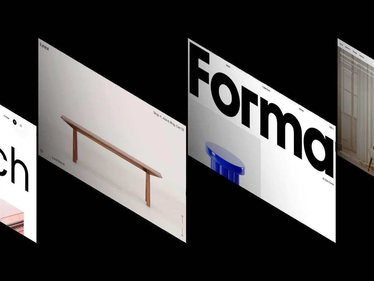
12 Best Interior Design Website Templates for Webflow, Framer and Shopify (2026)
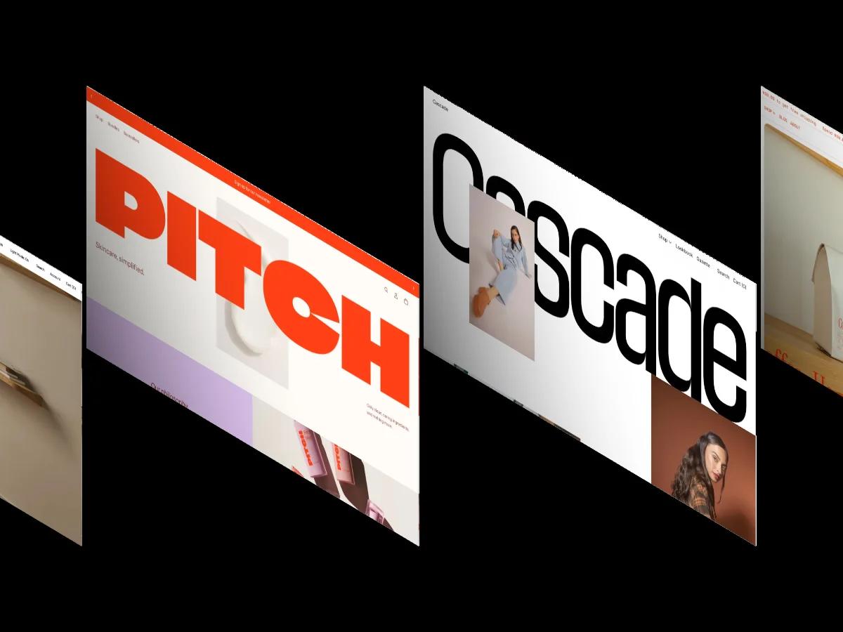
30 Best Modern Shopify Website Themes 2026
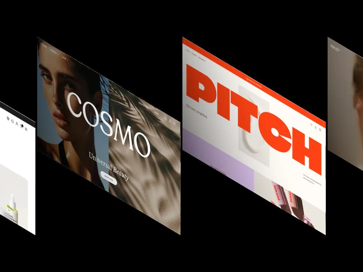
14 Best Beauty and Skincare Website Templates (2026)

Attention Span Statistics 2026: Where Every Number Comes From
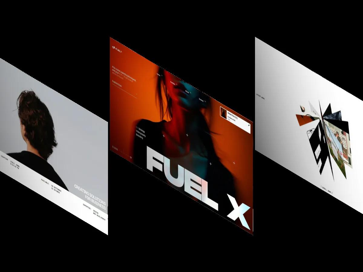
13 Best Portfolio Website Templates for Webflow and Framer (2026)
12 Best Personal Website Templates for Webflow and Framer (2026)