Brutalist is a high-quality Shopify template for Retail & E-commerce, Art & Design, Blog & Editorial by Switch.
Our Review of Brutalist
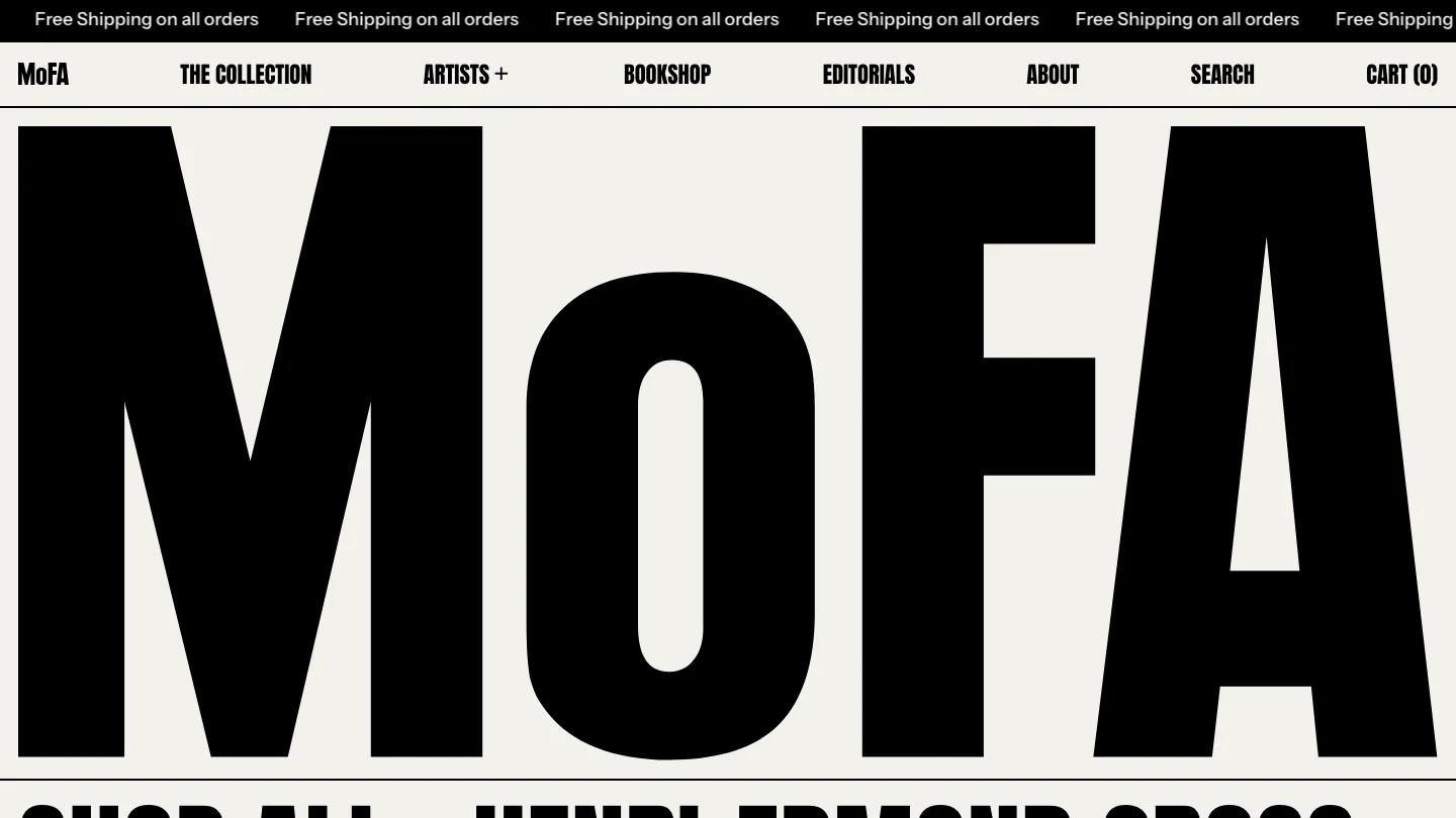
Brutalist is a Shopify theme for shops that want their typography to do the shouting, and the demo dresses it up as an online art print house called MoFA. The hero is nothing but that wordmark, set in black Anton so large it fills the whole width of the cream page. Under it, every artist in the catalog runs together as one giant paragraph of condensed capitals separated by dots, a statement and a menu at once. The header spreads uppercase links like Artists, Bookshop, Editorials, and Cart evenly across the bar.
Switch builds everything on thin black rules, like a printed catalog. A product carousel with dot pagination and big arrows shows rounded print images over titles and prices, then a painting fills a wide card for a timed release with a large countdown. Collection tiles name each artist over their work, and one of the best touches is a sortable table of the whole collection listing Title, Artist, and Price on ruled rows. From Our Studio to Your Home explains printing and framing in alternating text and photo cells, Exit Through the Book Shop sells books and a mug, and blog cards sit above a coral newsletter bar. The product page puts the print beside a huge title, a quantity stepper, an outlined Add to Cart, a solid Buy It Now, and a spec table for artist, origin, year, and medium.
On a phone, the wordmark still spans the screen, the artist list wraps into a dense block of capitals, and the header shrinks to Menu, Search, and Cart.
We'd pick Brutalist for print shops, bookstores, and record labels with a confident editorial voice. Replace the famous painters' names and the famous magazine logos in the press strip, and keep collection names short so the type stays readable.
Based on the live demo, viewed on desktop and on a phone. The Design and Dev scores come from separate independent reviews. See how we score templates.
Independently evaluated by our team of 6 designers and 5 developers.











Designers score design, developers score development, and each score is the average of their independent ratings. Read about our review team and how we score templates.