SwissTime is a high-quality Framer template for Personal, Art & Design, Waitlist & Coming Soon, Business & Startup by Swiss Themes.
Our Review of SwissTime
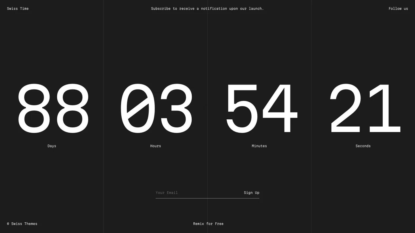
SwissTime is a countdown page for a product or brand that hasn't launched yet, and it does one job with real focus. The whole site fits in a single dark charcoal screen. Four giant white numbers count down the days, hours, minutes, and seconds, each with a tiny label underneath, and behind the middle two sits a large greyscale globe with Africa and Europe turned toward the viewer. Everything else is set in Martian Mono at a very small size, which makes the big digits feel even bigger by contrast.
The structure comes from Swiss Themes' fondness for grids. Thin vertical rules split the page into four equal columns, and each countdown unit sits in its own lane, so the layout reads like a timetable or a departure board. The top line holds the name in the left corner, a one-line invitation to subscribe in the center, and a Follow us link on the right. Below the globe, a single underlined email field with a Sign Up link handles the waitlist, with no box, no button fill, and no extra copy competing for attention. On a phone, the four numbers shrink and line up in one row across the globe, the email field stays right under them, and the follow link becomes short social labels in the top right. It all still fits on one screen.
We'd pick SwissTime for a studio, app, or event that wants a calm, confident holding page before launch day. There's nowhere to explain what's coming, though: no description, no image of the product, just the clock and the form. If visitors need a reason to sign up, plan to add a sentence or two. Also check that your launch date is set, since a countdown that reaches zero looks broken.
Based on the live demo, viewed on desktop and on a phone. The Design and Dev scores come from separate independent reviews. See how we score templates.
Independently evaluated by our team of 6 designers and 5 developers.











Designers score design, developers score development, and each score is the average of their independent ratings. Read about our review team and how we score templates.