SONI is a high-quality Framer template for Personal, Portfolio & Agency, Art & Design, Professional Services, Photography & Videography by Bryan Hermoza.
Our Review of SONI
SONI is a one-screen portfolio for a graphic designer, and it gets by on charm and a single electric blue. Everything is set in Roboto Mono on white. "I'm Soni" in large blue capitals sits under a cut-out headshot of a woman in a pink cap, outlined in a thick blue stroke like a sticker. A short pitch hugs the left edge, and a list of services, from Brand Identity to Web Design, sits on the right. The header is just as compact: a live clock with a city name, a blue pill menu, and an email link in the corner.
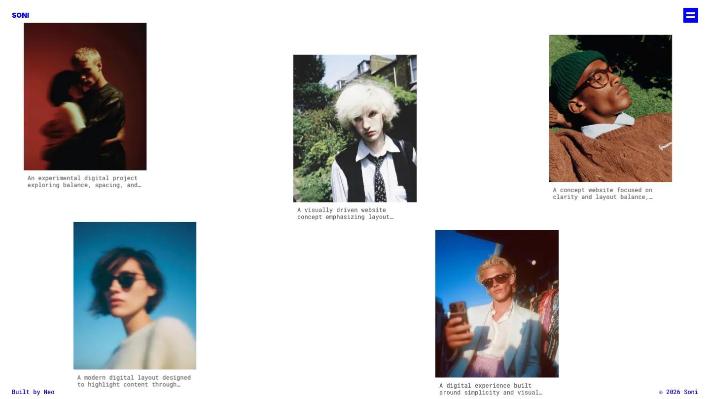
Bryan Hermoza keeps the homepage to that single composition, with a credit line, an Available for Work status and the copyright pinned along the bottom. The About page repeats the formula: a big SONI title, a centered mono paragraph, plain links to Instagram, LinkedIn and Behance, and a full-length cut-out portrait with the same blue outline. Another view trades the sticker look for a loose gallery, scattering portrait-format project photos across white space with truncated mono captions under each. The blue does all of the branding work.
On a phone, the services list and clock drop away, the pitch moves to the top, and the menu becomes a solid blue square with two bars. The headshot and name stay centered with plenty of room around them.
We'd pick SONI for illustrators, graphic designers and students who want a personal site that feels like a business card with a sense of humor. It depends entirely on a good cut-out photo of you, so plan a shoot against a clean background first. And because the homepage shows no projects, visitors must click through to Work to see anything, which suits people who hand out their link in person.
Based on the live demo, viewed on desktop and on a phone. The Design and Dev scores come from separate independent reviews. See how we score templates.
Independently evaluated by our team of 6 designers and 5 developers.











Designers score design, developers score development, and each score is the average of their independent ratings. Read about our review team and how we score templates.