Pluma is a high-quality Framer template for Technology & Software, Business & Startup, Digital Products, Blog & Editorial by Art4web.
Our Review of Pluma
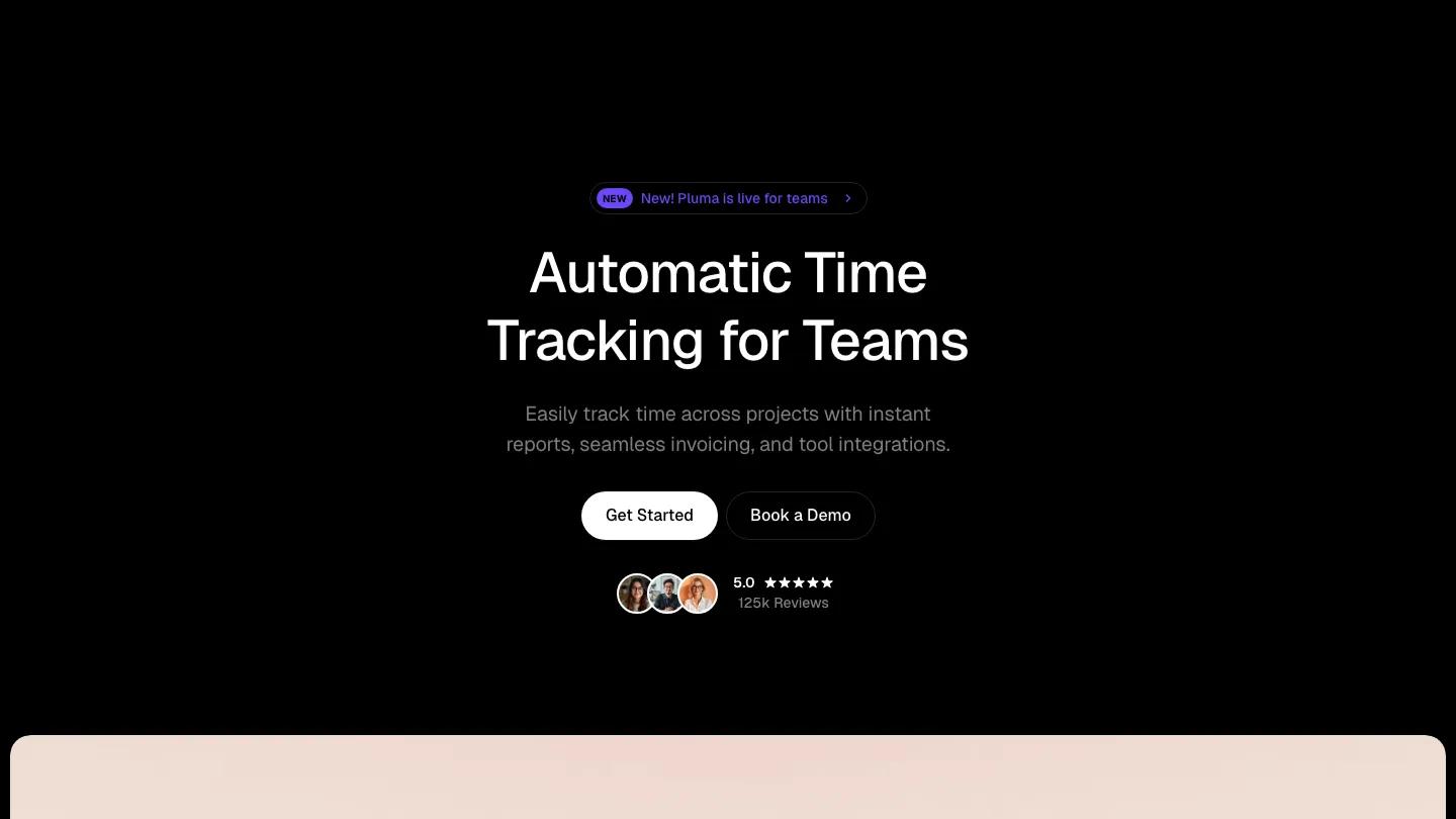
Pluma, a Framer template by Art4web, is dressed as a time tracking app for teams. The hero is plain black Geist on white: "Automatic Time Tracking for Teams", a short line about reports and invoicing, a black Get Started pill beside an outlined Book a Demo, and a small "Pluma is live for teams" badge above. Below sits a soft peach panel with an app view and a bright yellow timer card floating over it. A sun icon in the corner switches the whole site into a dark version that looks just as finished.
Three feature cards with small animated graphics come first, then a tabbed block where Calendar View, Automated Time Tracking and Bill Accurately each swap the app view beside them. A bento section mixes team avatars, a violet performance card and a big daily total, followed by a customer quote, a video testimonial, a wall of short quotes, and pricing cards with a monthly and annual switch, the enterprise card in solid black. News posts lead into an FAQ styled as a chat, questions in violet bubbles and answers in white ones. The Pages menu holds features, pricing, demo request, waitlist, integrations, changelog, about, careers, blog and contact pages. We like the chat FAQ: a small idea that makes a dull section feel friendly.
On a 390px phone the headline breaks into two centered lines, both buttons sit side by side, and Buy Pluma stays in the header next to the menu icon.
We'd pick Pluma for a B2B productivity tool that wants a quiet, grown-up look. Keep in mind every product mockup shows timers and calendars, so if your product does something else, plan to redraw them.
Based on the live demo, viewed on desktop and on a phone. The Design and Dev scores come from separate independent reviews. See how we score templates.
Independently evaluated by our team of 6 designers and 5 developers.











Designers score design, developers score development, and each score is the average of their independent ratings. Read about our review team and how we score templates.