Hoffen is a high-quality Framer template for Portfolio & Agency, Art & Design, Photography & Videography, Personal by Gustave Flowbert.
Our Review of Hoffen
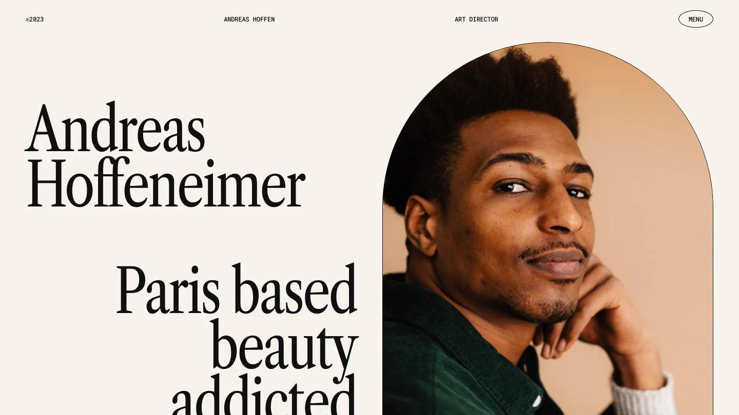
Hoffen is a single-person portfolio for an art director that pairs an editorial serif with blunt typewriter capitals. The hero sets the demo name in tall Libre Caslon Condensed on the left, then a right-aligned "Paris based beauty addicted" in the same face. On the right, a portrait sits inside a tall arch outlined with a hairline. The header is a quiet row of small monospace labels, a copyright year, the name, and the job title, with Menu in an outlined oval at the far end. The background is a warm pale blush.
Gustave Flowbert keeps the page short and lets rhythm do the work. Rows of slashes run across the full width as dividers. My Works arranges projects in a deliberately uneven grid, small cards beside one large one, each with a grey /01 style number on the left and the project name in mono capitals on the right. The work is mostly packaging and print, from a book on a green banquette to a pink box pattern and a navy label close-up. A short bio follows in big serif type beside a column of mono text and a list of past clients, and a black rounded panel closes the page with Can't Wait to Work Together and large contact links. The Projects page opens with Portfolio set huge inside an outlined pill shape, above another slash divider labelled with a short tagline.
On a phone, the name and tagline stay big and stacked, a short mono bio appears under them, and the arched portrait follows below.
We'd pick Hoffen for art directors, beauty and packaging designers, and photographers with a polished body of work. The demo bio lists famous agencies and brand names as past clients, so swap in your own. The header labels are also very small.
Based on the live demo, viewed on desktop and on a phone. The Design and Dev scores come from separate independent reviews. See how we score templates.
Independently evaluated by our team of 6 designers and 5 developers.











Designers score design, developers score development, and each score is the average of their independent ratings. Read about our review team and how we score templates.