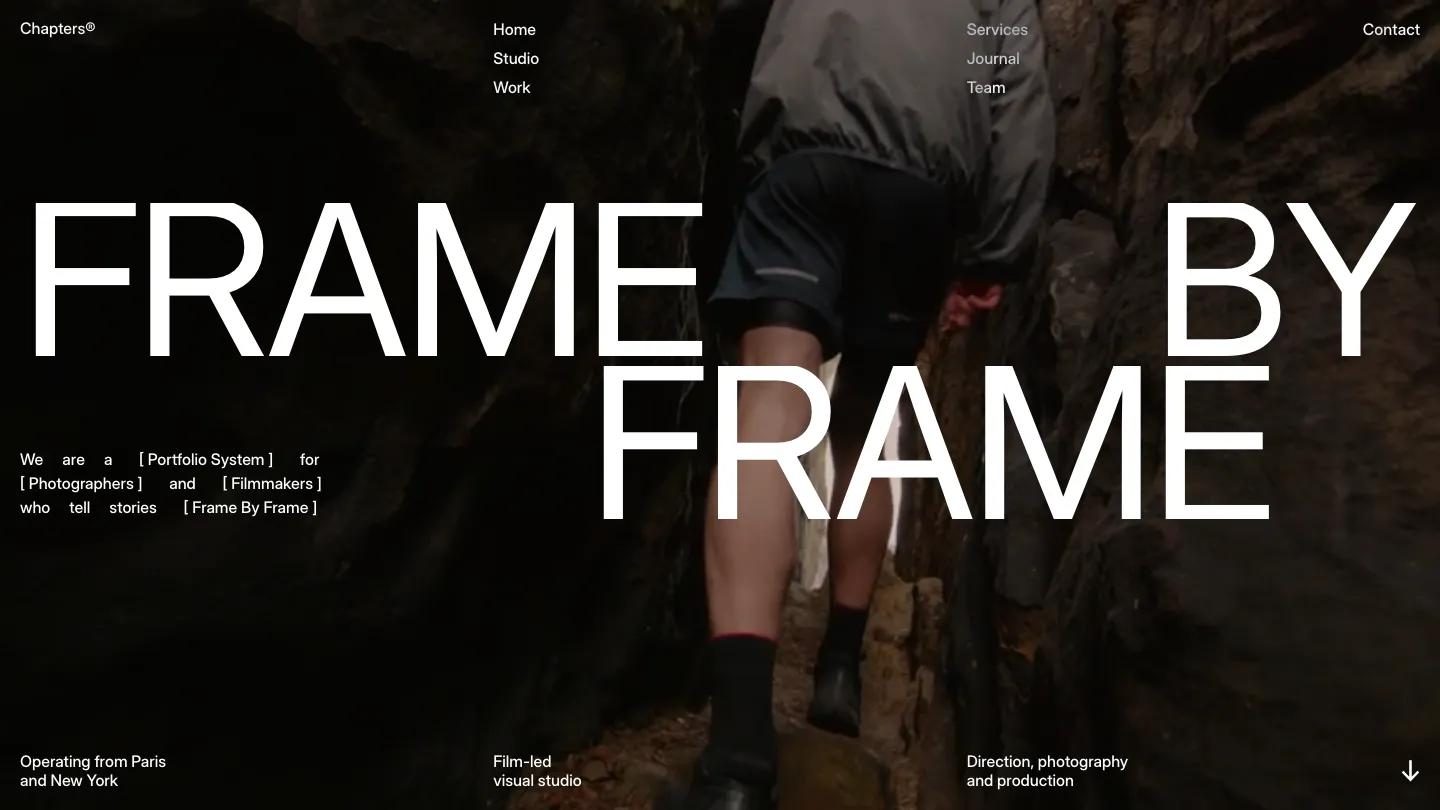
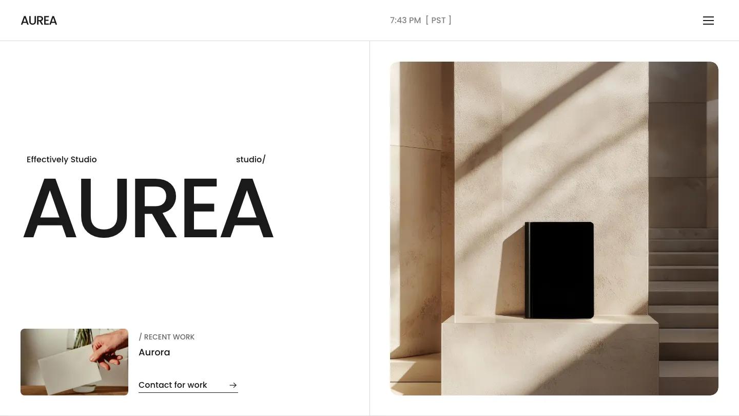
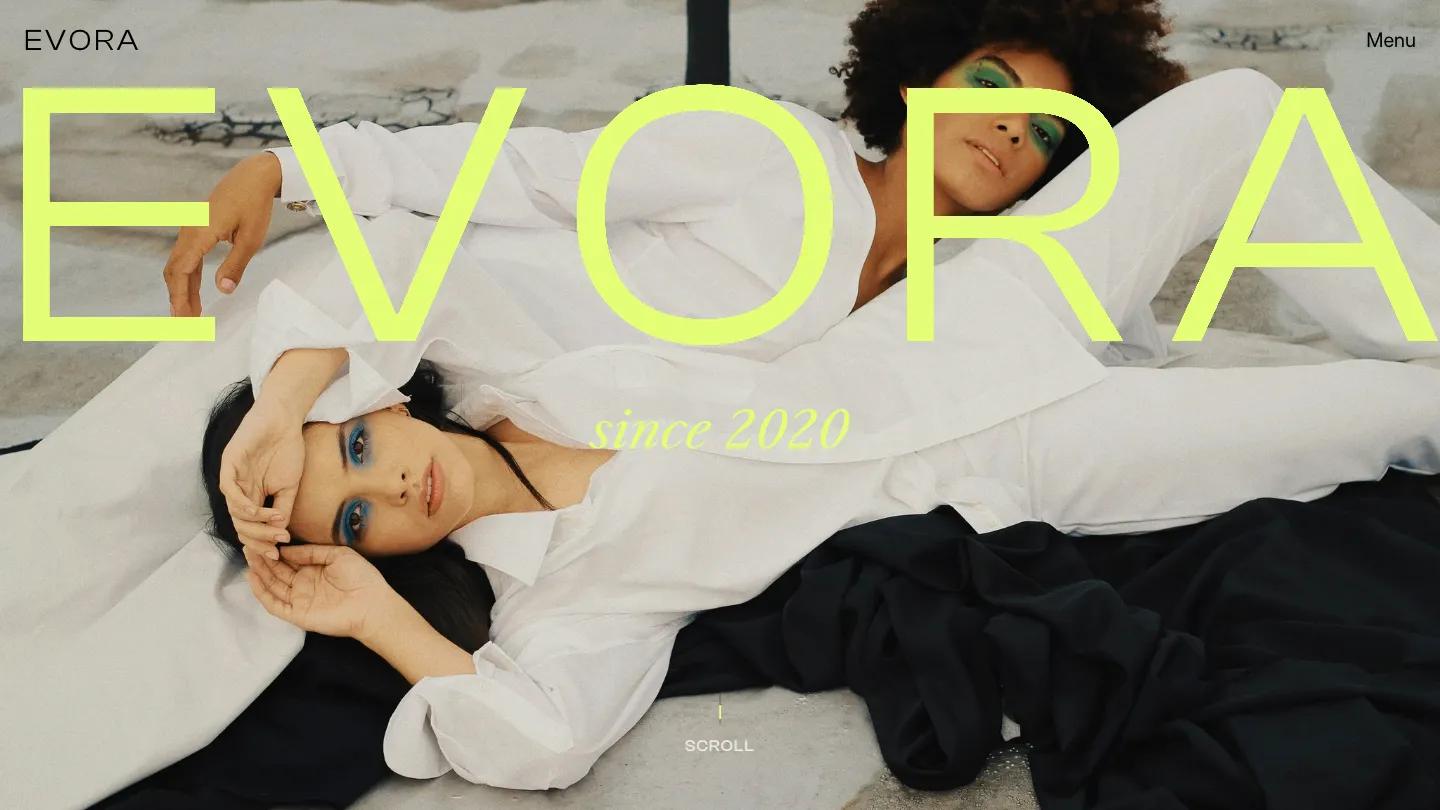
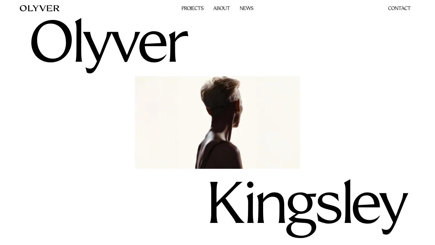
Eizo is a high-quality Framer template for Photography & Videography, Portfolio & Agency, Personal, Art & Design, Professional Services by Thaer Swailem.

Our Review of Eizo
Eizo is a portfolio for a photographer or videographer who wants the work up front and the talking kept short. The header works like a business card: a full name set huge in black Schibsted Grotesk, a small square portrait at the top right, a live clock, and a "Based in Japan" line. A thin rule sits underneath, then Home, Info, Projects, and Contact spread across the width, with short VM, YT, IG, and TW links tucked to the right. The page is white with black type, so all the color comes from the footage.
After a two-line intro, the homepage turns into a three-column grid of moving clips. Each tile carries an uppercase title and a grey discipline tag, so Silent Echoes reads as a Short Film and Luma Watch as a Product Video, and the mix runs from a misty desert figure to a fitness reel on painted stairs. Services follows with a big period-ended heading and bulleted columns for Photography, Videography, and Content Creation. Clients is a scrolling row of grey logo tiles, and a black footer closes with Let's Work Together, an email, a phone number, and spelled-out social links. Thaer Swailem keeps the Info page in the same voice: the identical header, a longer bio, a "Since 2017" note, and a horizontal strip of photos in mixed sizes.
On a phone, the name shrinks into a slim top bar with a plus icon for the menu, and the clips stack one per screen with their captions intact.
We'd pick Eizo for working shooters with a reel of strong short clips and a few still series. The grid needs real footage to come alive, so thin material will show. The client logos are placeholders, and the header name, portrait, and city all need swapping.
Based on the live demo, viewed on desktop and on a phone. The Design and Dev scores come from separate independent reviews. See how we score templates.
Independently evaluated by our team of 6 designers and 5 developers.











Designers score design, developers score development, and each score is the average of their independent ratings. Read about our review team and how we score templates.