Merida is a high-quality Shopify template for Retail & E-commerce, Furniture & Interior Design, Art & Design, Blog & Editorial, Events & Entertainment by Xotiny.
Our Review of Merida
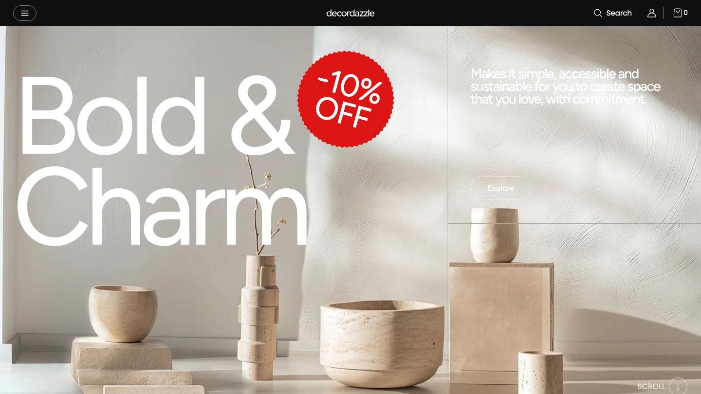
Merida is the stone and home decor preset of Xotiny's Florence theme, and it suits shops selling marble objects, ceramics and small furniture. The hero is a sunlit photo of travertine bowls and vases against a textured plaster wall, with "Bold & Charm" set enormous in thin white Figtree across the left half. A red scalloped sale sticker sits beside the ampersand, and a short brand line with an outlined Explore button fills a narrow right column. The header is a black bar with a round menu button, a centered wordmark, and search, account and cart icons.
Below, the homepage reads like a catalog on a thin-ruled grid. Featured pairs a short intro with product cards on soft beige backdrops, with color swatches under items like the Diaspro Bowl, and a Best seller block follows. A sale banner leads into a row of client quote boxes, then a brand story wraps a long uppercase manifesto about nature around a black and white team portrait and material samples. Icon tiles cover shipping, assembly and returns, a black marquee announces a sale with a countdown, and an Events list shows workshops with address, time and Register buttons. Journals and a huge wordmark footer close it. The product page sets a large gallery beside the title, material and size pills, and Care & Maintenance accordions, though a sale popup with a countdown covers it on arrival.
On a phone, the headline stays big, the sticker tucks into the corner, and the menu moves to a pill on the right. Some intro text lands over the pale stone photo and gets hard to read.
We'd pick Merida for decor and stone studios with a calm, neutral catalog and events to promote. We'd tone down the popup, and plan photography in the same warm, pale tones, because the white text depends on it.
Based on the live demo, viewed on desktop and on a phone. The Design and Dev scores come from separate independent reviews. See how we score templates.
Independently evaluated by our team of 6 designers and 5 developers.











Designers score design, developers score development, and each score is the average of their independent ratings. Read about our review team and how we score templates.