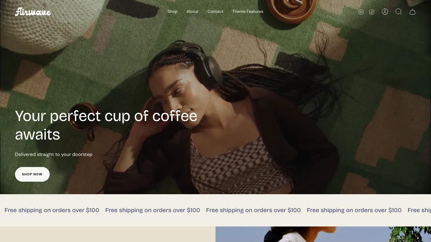
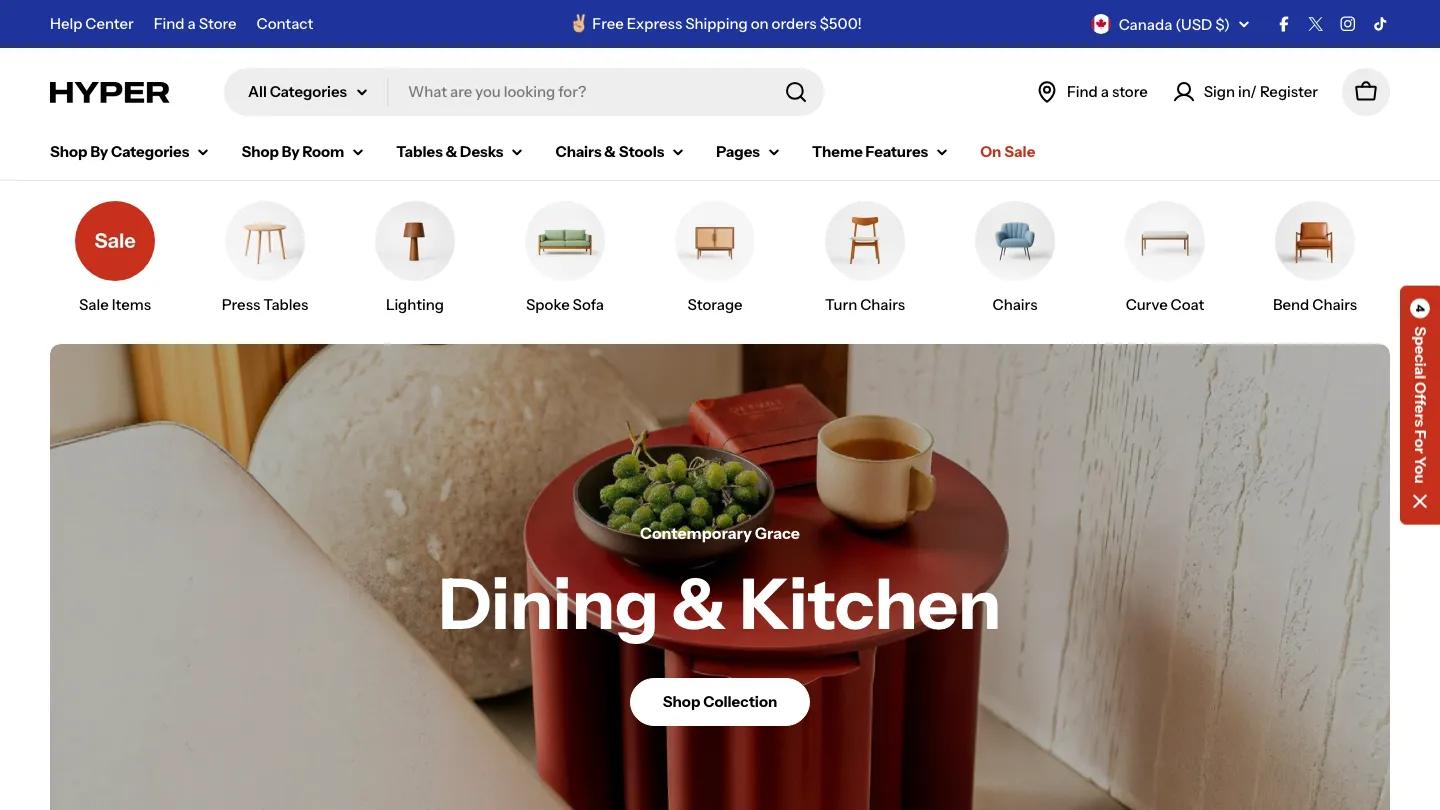
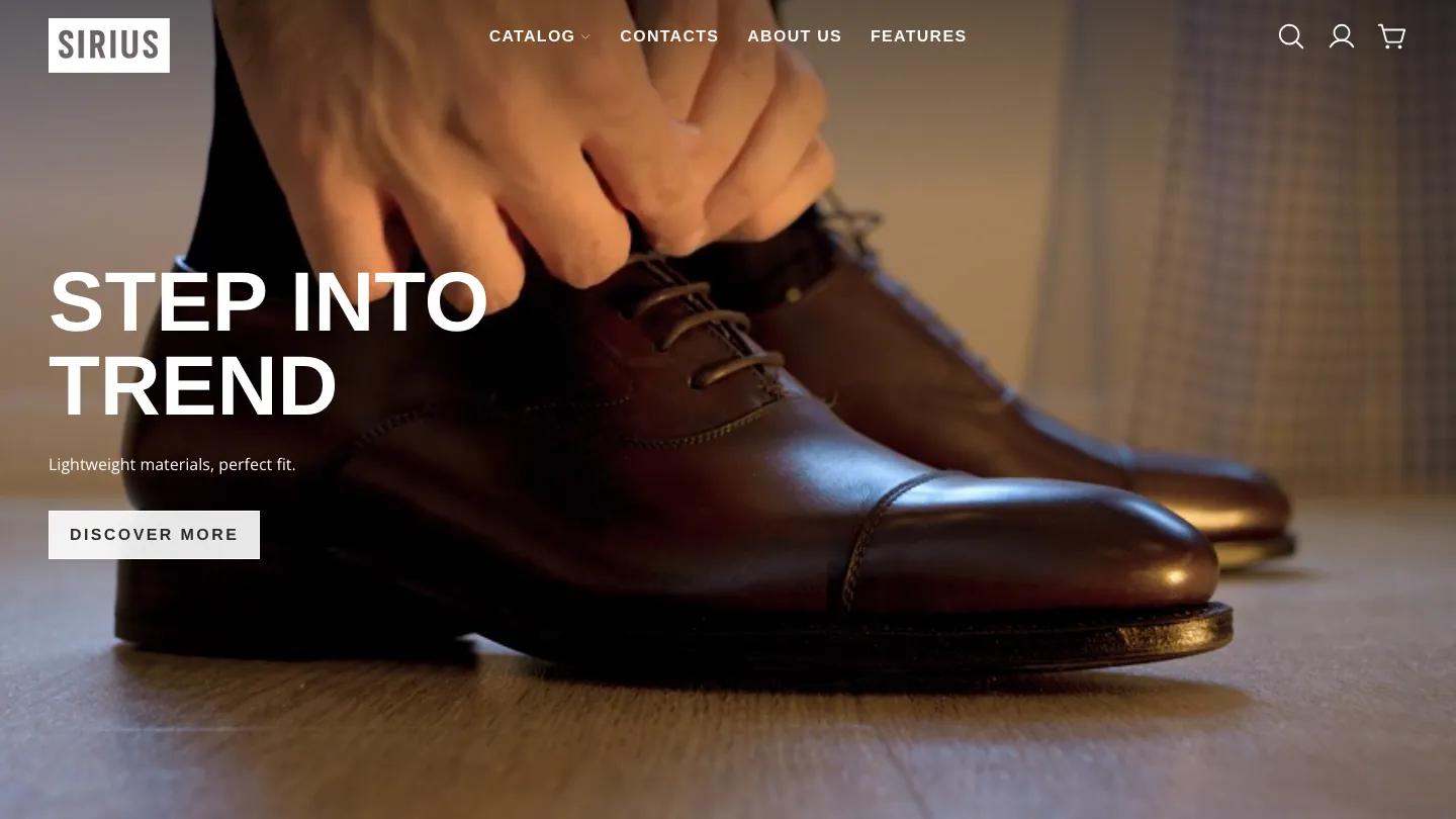
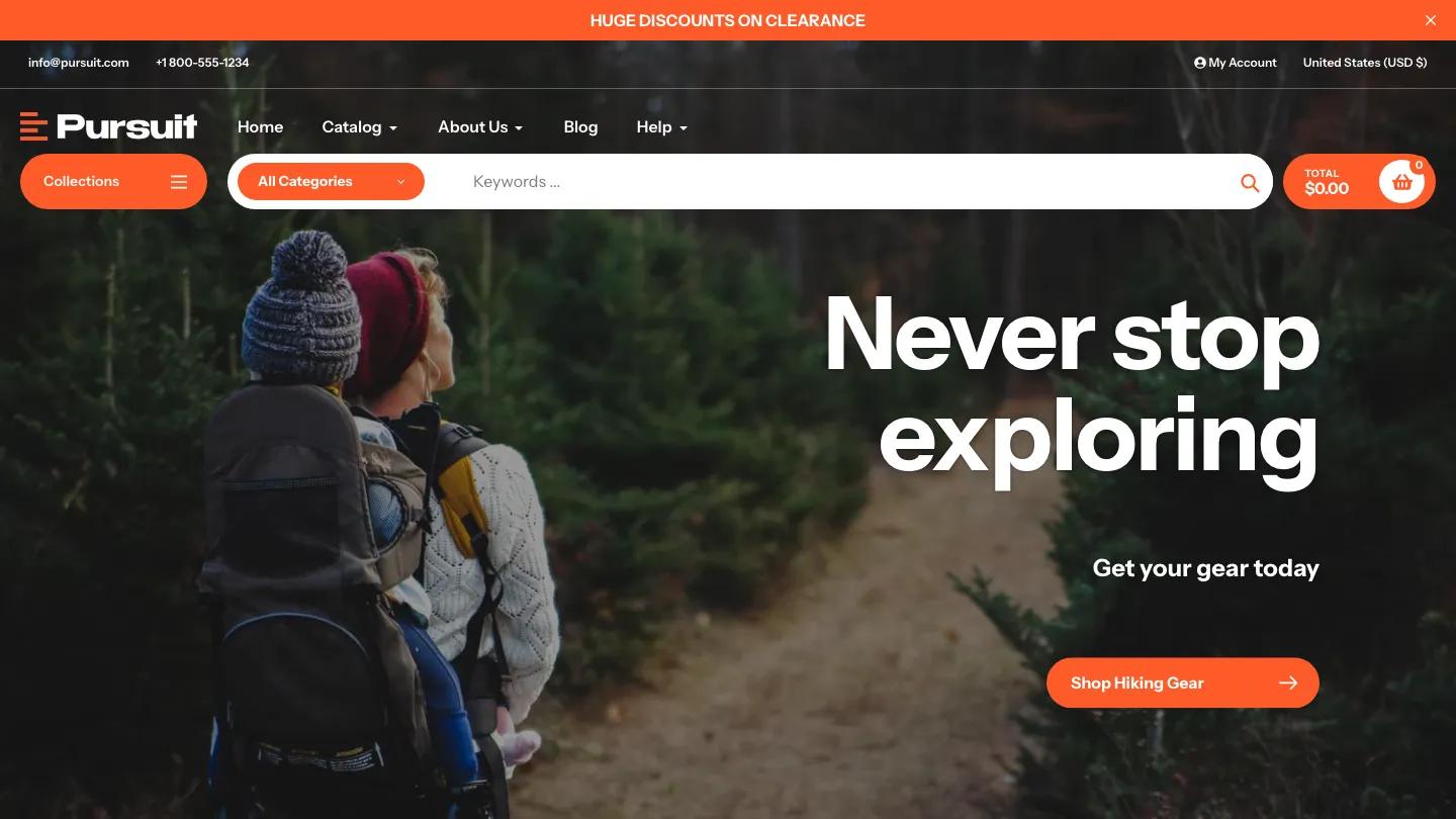
Alchemy is a high-quality Shopify template for Retail & E-commerce, Fashion & Accessories, Sports & Fitness, Business & Startup, Environment by Clean Canvas.
Our Review of Alchemy
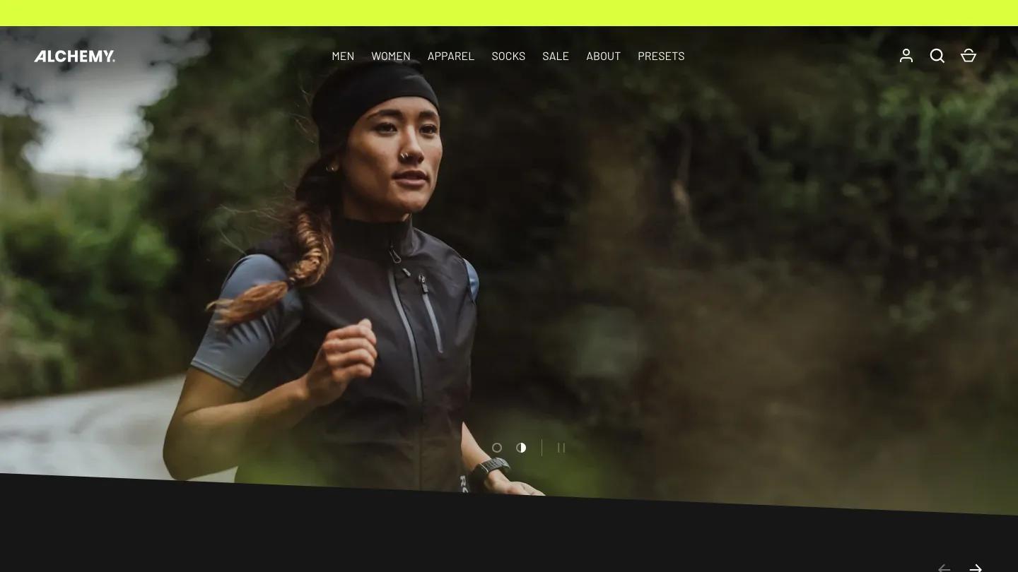
Alchemy's Sharp preset, from Clean Canvas, turns the theme into a dark, sporty store for recycled running gear. The hero is a slideshow of trail runners, with a small Ground-Breaking label and "100% Recycled Sportswear" in heavy italic Barlow caps, the first line knocked out of a white box. Two outlined buttons sit underneath, the bottom edge of the slide is cut at an angle, and a neon yellow bar runs across the top.
Those slanted edges repeat all the way down and give the page its forward lean. Our Socks is a carousel of product cards on charcoal with small Sold Out tags, followed by an italic marquee and a video section headed Uniting People to Our Movement. The Alchemy Way shows athlete portraits, and a flash sale panel with a countdown floats over muddy trail shoes. A featured product, an environmental promise over a sea turtle photo, testimonials, and a blog with one large feature follow. The product page stays dark, with an image carousel, italic perks beside small icons, and color swatches.
On a phone, the hero swaps to a trail photo with stacked white caps, the two buttons sit side by side, and the sock carousel starts right below, ready to swipe.
We'd pick Alchemy for activewear and outdoor brands with action photography and an environmental angle. The dark palette and angled cuts would feel heavy for a soft or pastel brand. The products and photos also come from a real sock maker, so all of it needs replacing.
Based on the live demo, viewed on desktop and on a phone. The Design and Dev scores come from separate independent reviews. See how we score templates.
Independently evaluated by our team of 6 designers and 5 developers.











Designers score design, developers score development, and each score is the average of their independent ratings. Read about our review team and how we score templates.