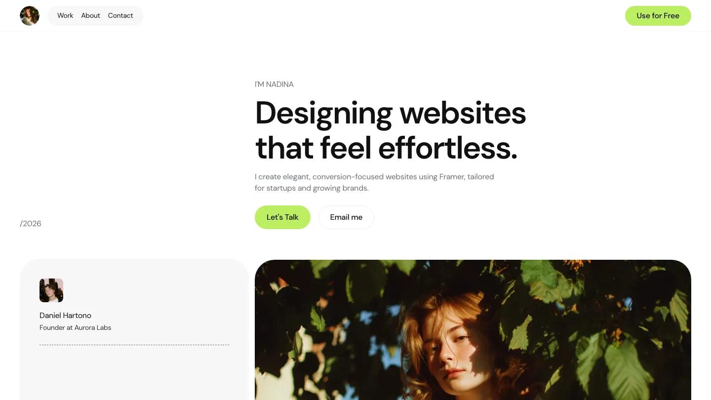
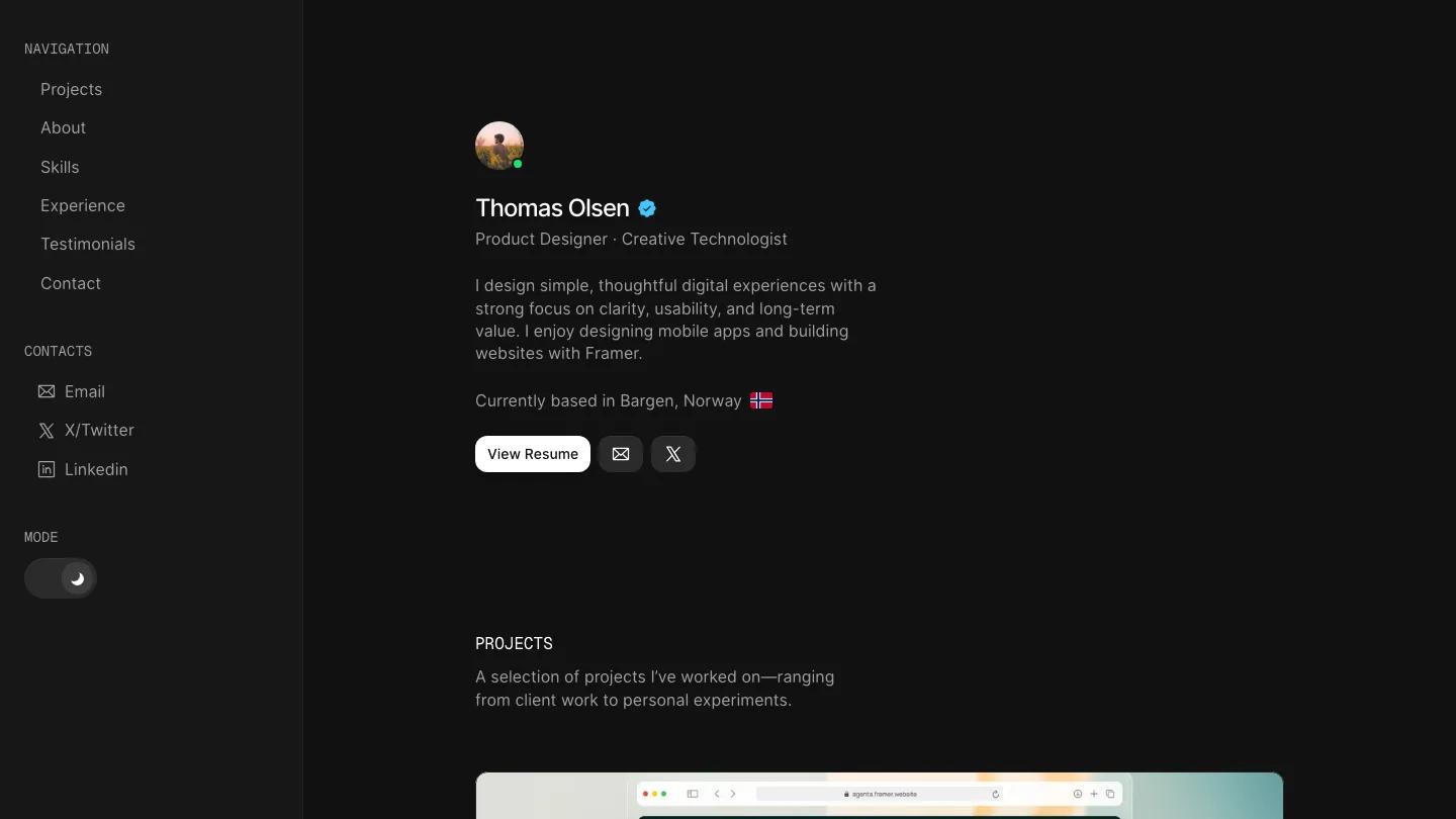
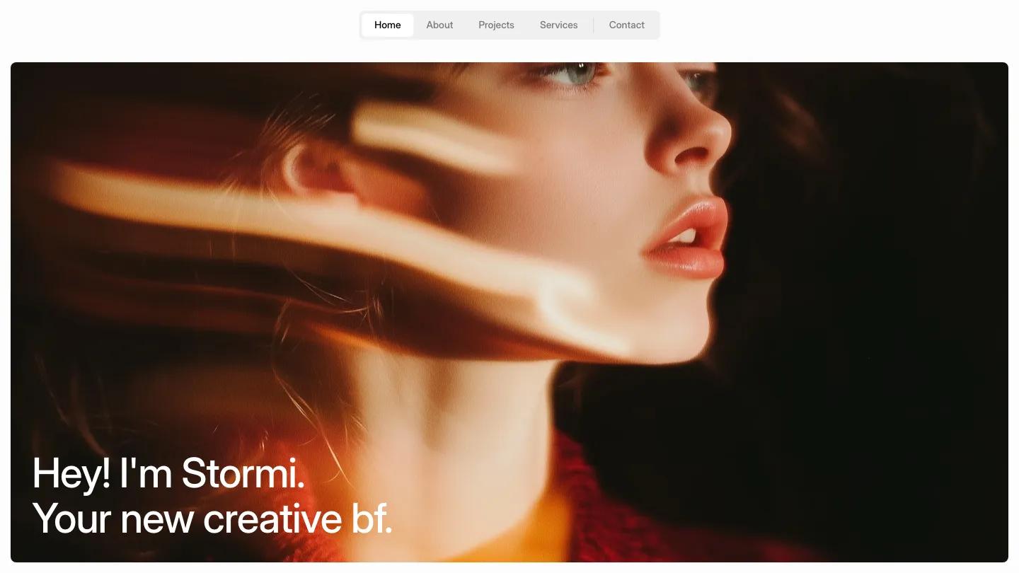
PaperNote is a high-quality Framer template for Personal, Portfolio & Agency, Art & Design, Professional Services, Fashion & Accessories by Nick404.
Our Review of PaperNote
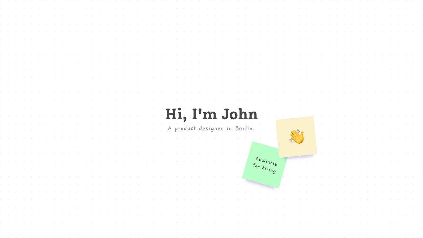
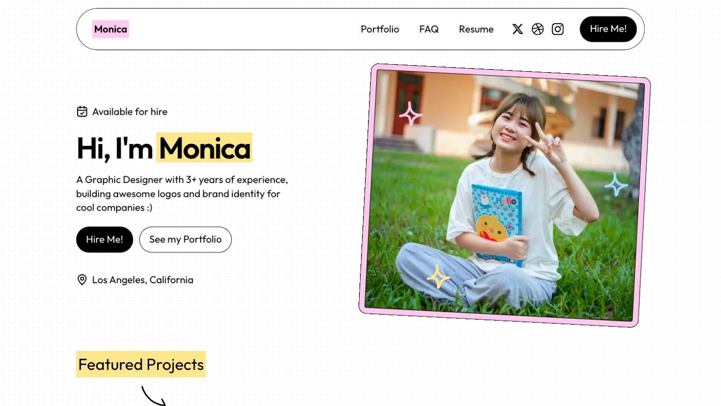
PaperNote, a Framer portfolio template by Nick404, feels like a scrapbook. The white page has a faint dot grid, headings sit on yellow highlighter marks, hand-drawn arrows point down into each section, and little four-point sparkles in pink, blue and yellow float around the edges. The hero introduces a graphic designer in big, friendly Outfit type beside a tilted photo with a pink outline, and a rounded pill header carries the name, portfolio, FAQ and résumé links, social icons and a black Hire Me button.
The homepage runs in a tidy order. Featured Projects shows logo work on cards in blue, yellow and pink, each with a See Project button,. My Services is a two-by-two grid of pastel cards for branding, print, packaging and illustration. My Experience stacks job cards in alternating colors with dates and a short description, then About Me pairs a photo fanned over colored frames with a longer bio and a Contact Me button. An FAQ of blue accordion rows and a black Ready to Bring Your Vision to Life footer close the page. The portfolio page repeats the colored cards in a two-column grid. We like how consistent the paper metaphor is. Even the service and job cards have a little punched hole in the corner, like index cards.
On a 390px phone everything centers: the highlighted greeting, the two buttons side by side, the location line and then the tilted photo underneath, with the header folding into a menu icon.
We'd suggest PaperNote for a junior graphic or brand designer who wants something warm and approachable. Worth knowing first: the pastel cards and doodles are a strong personality, so they suit playful logo and illustration work much better than serious corporate or editorial projects.
Based on the live demo, viewed on desktop and on a phone. The Design and Dev scores come from separate independent reviews. See how we score templates.
Independently evaluated by our team of 6 designers and 5 developers.











Designers score design, developers score development, and each score is the average of their independent ratings. Read about our review team and how we score templates.