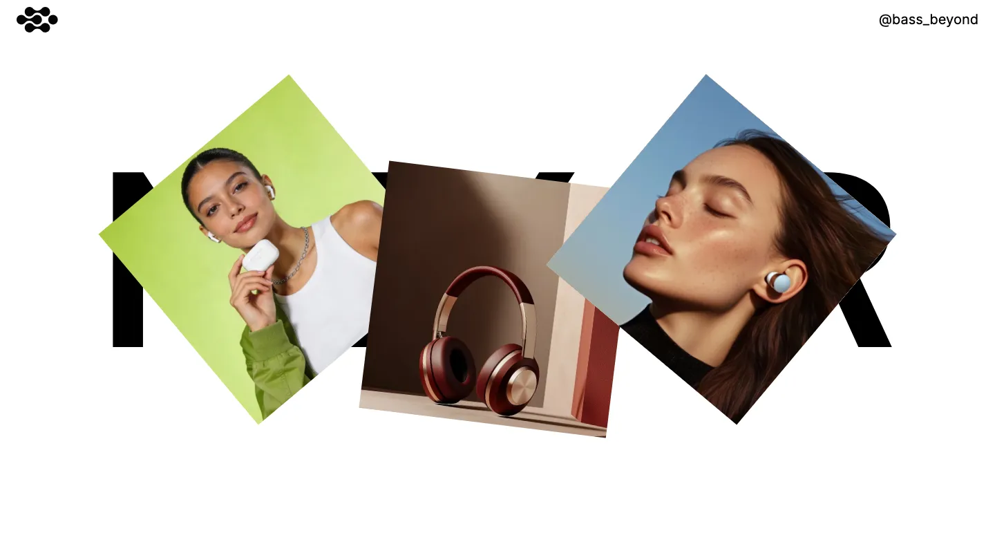
10 Best Free & Paid Framer Website Templates 2026


Finding quality Framer templates that work across different industries is challenging. We've tested and hand-picked 10 of the best free and paid templates available, organized by use case—whether you're building client sites, launching products, or establishing your creative presence.
You've spent hours designing a concept in Framer, only to realize you're rebuilding features that should've come pre-built. A navigation system that actually works. A contact form that doesn't feel clunky. A footer that scales properly across devices. These aren't luxuries—they're baseline expectations, and yet finding Framer templates that deliver on all of them is frustratingly harder than it should be.
The template ecosystem for Framer has grown, but quantity doesn't mean quality or variety. You'll find plenty of landing pages and portfolios, sure, but templates that work across different industries and use cases? That actually respect your design sensibilities instead of locking you into a narrow aesthetic? Those are rarer. And when you're evaluating whether to start from scratch or use a template, you need real options to compare, not just a list of whatever's trending that week.
Here's what we've done: we've hand-picked the 10 best Framer templates available right now—both free and paid—across multiple categories and use cases. We've tested them, looked at what makes them actually useful beyond first impressions, and organized them by what they're genuinely good for. Whether you're building a client site, launching a product, or establishing your own creative presence, you'll find something worth your consideration here.
elias
This is typography-forward design at its best. Elias uses monochrome restraint and bold typographic hierarchy to create an atmosphere of intentional sophistication. Variable fonts respond fluidly to different contexts, while custom cursors and subtle animations add personality without overwhelming the core message. The CMS structure allows photographers, designers, and creative agencies to manage their work efficiently, and the multi-page architecture supports a full portfolio ecosystem with dedicated spaces for projects, about, contact, and a proper 404 page.
The template works exceptionally well for professionals who want their work to speak first. A designer with strong typographic taste or a photographer curating a cohesive visual identity will find the constraints here actually liberating rather than limiting. The responsiveness holds up across devices without sacrificing the desktop-first design sensibility.
Where elias truly distinguishes itself is in the refinement of its component library. Every element feels considered rather than premade. The rich media handling keeps large photography and video assets from feeling sluggish, and the animation work is restrained enough that it enhances rather than distracts. The development and design scores both hit 9.50 for good reason. The main limitation is its narrow stylistic band. If you need warmth, playfulness, or colorful expression, you'll feel constrained here.
Elias is best for creatives and agencies that can leverage clean typography and monochromatic palettes to their advantage.
nonstop
Nonstop targets the professional services and corporate world with a light-touch modern approach. It strips away decoration in favor of clarity, using clean typography and deliberate whitespace to guide attention. The template includes both light and dark themes, overlays and modals that feel native to the design, and a full multi-page structure with 404 handling. Animation support is built in without being default or aggressive.
This template suits agencies, consultancies, and service-based businesses that need to communicate competence and trust. It works equally well for documentaries or editorial projects where the content needs breathing room. The development score of 9.50 reflects solid component architecture that doesn't lock you into rigid patterns.
The strength here is restraint. Every feature included serves a purpose, and nothing feels decorative. The layout templates provide starting points without forcing a single design direction. The responsiveness is thorough without needing to compromise the desktop aesthetic. The minor trade-off is that at 9.40 design score versus 9.50 development score, the template's layout systems are slightly more compelling than its visual voice. This matters less if you plan to customize typography and color, but matters more if you're looking for immediate visual distinctiveness.
Nonstop rewards teams that appreciate professional minimalism and can build visual identity through customization.
nori
Here's a genuinely versatile free option. Nori packs an impressive feature set: multi-page structure, dedicated blog, sticky scrolling effects, full CMS support, plus all the expected pages (about, projects, contact, services, pricing). Its design stays modern and minimal without defaulting to boring, using bold typographic moves and clean layouts that feel contemporary without being trendy.
The free price point makes this particularly strong for emerging agencies, freelance creatives, and professionals building their first portfolio site. The component library and form support mean you can build beyond the template without wrestling with Framer basics. The animation capabilities are available if you want them, but the design doesn't depend on motion to work. Whether you're a photographer, designer, consultant, or writer, nori provides enough structure to feel complete while remaining flexible enough to customize.
The development score of 9.00 and design score of 9.20 reflect a template that's genuinely well-built without requiring advanced Framer skills to use effectively. The sticky scrolling implementation is worth noting specifically, it creates visual interest during navigation without feeling gimmicky. For creatives looking at the broader range of portfolio and agency templates available, nori punches above its weight at no cost.
The one realistic limitation is that the free status means fewer ongoing updates or feature additions compared to paid options, though the core structure is solid enough that it ages well.
Nori is the strongest free choice for creatives who want a professionally functional portfolio without limitation.
pastel-lab
Pastel-lab takes a different direction entirely: it introduces genuine color to this template lineup without sacrificing professional presentation. The pastel palette creates warmth and personality while the minimal, typographic structure keeps it feeling controlled and current. CMS support, animation, and responsive components are all standard, but what matters here is the color work. A soft palette applied with confidence changes the entire emotional tone of a portfolio.
This template suits creatives working in personal branding, design agencies that want their own site to reflect personality, and professionals in creative fields who need to move beyond monochrome conventions. The balanced design and development scores of 9.00 across the board mean there's no compromise between aesthetics and functionality. The component library supports the color story throughout, from buttons to forms to project cards.
What stands out is that pastel-lab doesn't use color as decoration. It's structural. The palette creates emphasis and hierarchy in ways that pure monochromatic design cannot. For designers specifically, this template demonstrates smart color restraint. A few colors applied consistently create more impact than a rainbow approach. The services page, contact page, and project showcase pages all benefit from this cohesive approach. The limitation is that the pastel aesthetic won't suit everyone. If you need dark, bold, or saturated color, this isn't your match.
Pastel-lab proves that personality and professionalism aren't mutually exclusive in web design.
swiss-time
Swiss-time is a single-page coming soon or waitlist template with a specific purpose: get people to sign up before your launch. The design centers on dark monochromatic styling, clean typography, and animation as the main visual interest. Form support is built in, components are available for customization, and the responsive behavior ensures the signup message lands correctly on mobile.
This template works best for founders, creators, and teams launching something and building anticipation. The waitlist mechanic is the feature that defines it. Unlike multi-page portfolio templates, swiss-time commits to one job and does it well. The animation language is polished enough that it sustains interest on a page with limited content variety. The design score of 9.25 reflects strong visual craft, while the development score of 8.25 suggests the animation implementation may require light customization for more complex interactions.
The animation work is the real story here. The movement feels purposeful rather than reflexive, which is harder to achieve than it sounds. For a coming-soon page, this matters more than for a full portfolio. The dark aesthetic works against anything but premium or tech positioning. This template would look odd for a playful product or a community-focused launch. If your launch moment needs to feel sophisticated and intentional, swiss-time delivers. If you're starting a casual creative project, it may be overkill.
Swiss-time is ideal for builders who want their launch page to feel as polished as the product itself.
origostudio
Origostudio leans into bold, modern minimalism with strong typographic presence. The multi-page structure supports full portfolio, service, and about page architecture. CMS integration, form support, and proper 404 handling come standard. The design score of 9.00 is earned through confident visual decisions: good negative space, clear hierarchy, and type-first composition.
This template suits design agencies, photographers, creative consultants, and service-based professionals. The clean aesthetic works as a neutral canvas for your own visual identity without demanding a specific color palette or photographic style. The typography options and layout flexibility mean you can adapt the foundation without fighting the design direction.
The development score of 8.20 is lower than its design score, suggesting the components and CMS structure require a bit more hands-on configuration than some other paid options. This isn't a weakness if you're comfortable with Framer; it's actually where customization becomes easier. The projects page and services page give you the content organization tools needed for real-world portfolios. Responsive design is thorough, and the component library supports consistent visual language across pages.
The trade-off is straightforward: origostudio rewards teams willing to spend a bit of setup time in exchange for more flexibility than pre-configured templates offer.
Origostudio is best for agencies and creatives who want a strong modern foundation and are willing to customize it to their specific needs.
unframed
Unframed takes an interesting path: it's free, multi-page, and includes ecommerce support alongside the standard portfolio features. Grid-based layout, clean typography, and light styling create a professional foundation. The component library, animation support, layout templates, and overlay/modal systems mean you're not just getting a template, you're getting building blocks.
This template works well for designers selling digital products, photographers offering prints, creative professionals needing portfolio plus shop functionality, and agencies that want a full-featured site without subscription cost. The fact that it's free doesn't mean it's simpler. The features list is longer than many paid competitors.
The development score of 8.70 edges out the design score of 8.40, which suggests the technical implementation and component architecture are particularly thoughtful. This matters if you plan to extend the template beyond its default pages. The ecommerce feature integration is clean without being intrusive. The form handling and responsive behavior hold up across the full feature range. The grid aesthetic is strong enough to create visual cohesion without being one-dimensional.
The realistic limitation is that free templates sometimes lack the immediate visual polish of paid options, and ongoing support depends on community contribution. The grid aesthetic, while professional, has become somewhat expected in modern web design. But the scope and capability here make that trade a fair one.
Unframed delivers surprising depth for a free template and genuinely competes with paid options on features.
brave-studio
Brave-studio is feature-rich in ways that push beyond standard portfolio templates. 3D transforms, custom cursors, slideshows, sticky scrolling, and a full blog system combine with CMS support and comprehensive multi-page structure. The design score of 9.00 reflects confident modern aesthetics with motion as an intentional tool, not default decoration.
This template suits creative agencies building their own presence, designers comfortable with motion design language, and creative professionals who want their site to demonstrate their capabilities rather than just showcase their work. The feature depth means you can build almost anything within the portfolio/agency space. The component library is generous, and the layout templates provide direction without locking you into one path.
The development score of 8.00 is lower than the design score, which signals that all these features require setup understanding. This isn't a beginner's template. You need to feel comfortable in Framer's component ecosystem and animation tools to fully utilize what's here. The 3D transforms and custom cursor work are particularly powerful but demand intentional implementation. The services page, projects showcase, and blog system all work well once configured. The sticky scrolling and modal overlays create sophisticated interaction patterns when used with purpose.
The trade-off is complexity in exchange for capability. If you need something immediately operational, look elsewhere. If you want a feature-forward foundation for a polished agency site, brave-studio rewards the setup investment.
Brave-studio is best for experienced Framer users and agencies that can leverage advanced motion and interaction to strengthen their creative positioning.
tdmoro
Tdmoro combines CMS flexibility with a strong feature set: 3D transforms, sticky scrolling, variable fonts, rich media support, and a complete blog infrastructure. The dual light/dark capability is built in. The design and development scores are equal at 8.50, suggesting balanced execution between aesthetics and technical implementation.
This template works for professional services, design studios, creative agencies, and portfolios that need blog functionality alongside their project showcase. The grid-based layout creates visual structure without becoming formulaic. The typography flexibility through variable fonts is particularly useful when you want text to feel distinctly customized. The pricing page support suggests this template anticipates service-based positioning.
The 3D transforms and sticky scrolling are implemented here but feel less central to the design story than in brave-studio. They enhance rather than define. The multi-page architecture handles about, contact, projects, services, and blog pages smoothly. The rich media support ensures video and imagery don't degrade performance. Responsive behavior is handled thoroughly across this broader feature set.
The realistic consideration is that with this many features, the template requires some configuration understanding. It's not a click-and-use option. The layout templates provide starting points, but customization will be part of your setup. The variable fonts feature is more valuable to designers than generalists, so not every user will leverage every capability.
Tdmoro is strongest for professional service providers and creative agencies that need blog and project showcases alongside their core offering.
balanceo
Balanceo rounds out the paid options with a business-focused template that includes jobs and careers page support alongside the standard portfolio features. CMS, blog, pricing, form handling, and ecommerce-adjacent rich media support create a genuinely broad toolkit. The grid-based layout, modern typography, and light aesthetic set a professional tone without being stern.
This template is engineered for larger agencies, professional services with team showcases, companies hiring alongside their portfolio presentation, and creatives wanting to scale beyond solo practice. The jobs and careers page is the distinctive feature. It suggests balanceo anticipates growth and team visibility. The component library supports this ambition, providing consistent visual language across more pages and sections than simpler templates.
The design score of 8.60 and development score of 8.00 represent solid execution with slightly more emphasis on visual craft than technical innovation. The slideshows and layout templates provide flexibility in how content is presented. The sticky scrolling and rich media support create engagement on longer pages. Responsive behavior across all these pages and features is handled capably, though complex layouts sometimes require mobile-specific attention.
The limitation is that the breadth of features assumes you'll use most of them. If you only need portfolio and contact, the extra pages and structural complexity are overhead rather than benefit. The grid aesthetic, while professional, works within a narrower stylistic band than some alternatives.
Balanceo is best for agencies and professionals planning to grow and needing a website structure that scales with ambition.
Final Thoughts
The best Framer template ultimately depends on what you're trying to accomplish. If you're building a portfolio or creative business site, design-forward templates with strong visual hierarchy tend to perform better than generic layouts. Developers and agencies benefit most from templates that prioritize clean code and customization depth, while startups and service-based businesses often find success with templates that balance aesthetics with quick deployment. The key is matching the template's design philosophy to your actual business needs rather than simply choosing based on visual appeal alone.
If you're still uncertain which direction to go, start by identifying your primary goal: are you trying to showcase work, sell a service, build credibility, or launch quickly? Once you've answered that, return to the templates that align with that objective and spend time in the editor before committing. Framer's intuitive interface means you'll get a real sense of how each template handles your content within minutes, so trust that hands-on feel more than any written description.